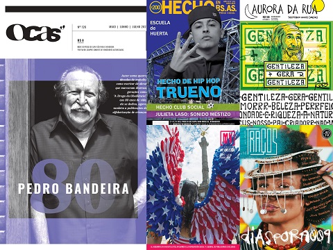
Our most hotly contested INSP Award this year was for Best Cover – with a whopping 63 entries from street papers around the world!
The Best Cover Award recognises a cover design that has had a big impact on the street, whilst effectively telling a story. The front page should be striking – grabbing attention from passers-by and drawing them to buy the publication.
Our top ten, featured below, will now go forward to our editorial shortlisting panel, who will choose the five finalists. These will be announced in early August, and the winner will be revealed at the Global Street Paper Summit in Glasgow.
The Nominees:
1. Faktum, Sweden
Claes Malmberg
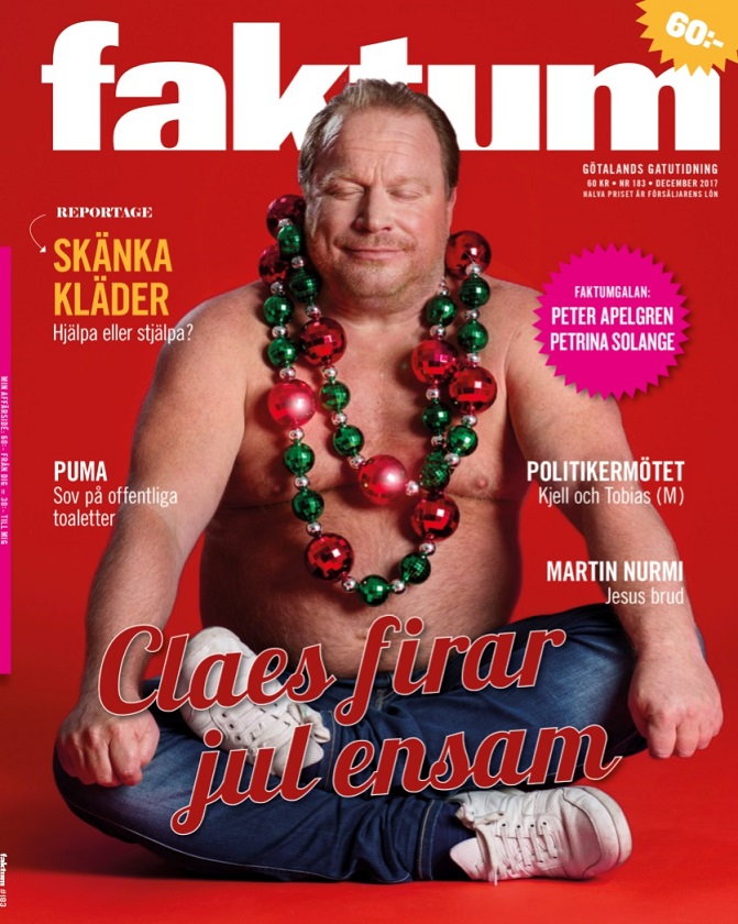
Faktum said: Claes Malmberg – a famous comedian, an actor, a Buddhist, divorced and the father of five children. He is spending Christmas alone. Why? He does not like the great pressure and expectations. It creates anxiety. On the cover we wanted to play with Christmas’s Christian message, colour and attributes, with Claes sitting in his yoga position and actually resembling Buddha. And at the same time highlighting the fact that everyone does not have a family to celebrate Christmas with – we are not alone in our loneliness.
2. Kralji Ulice, Slovenia
I, human. I, beast.
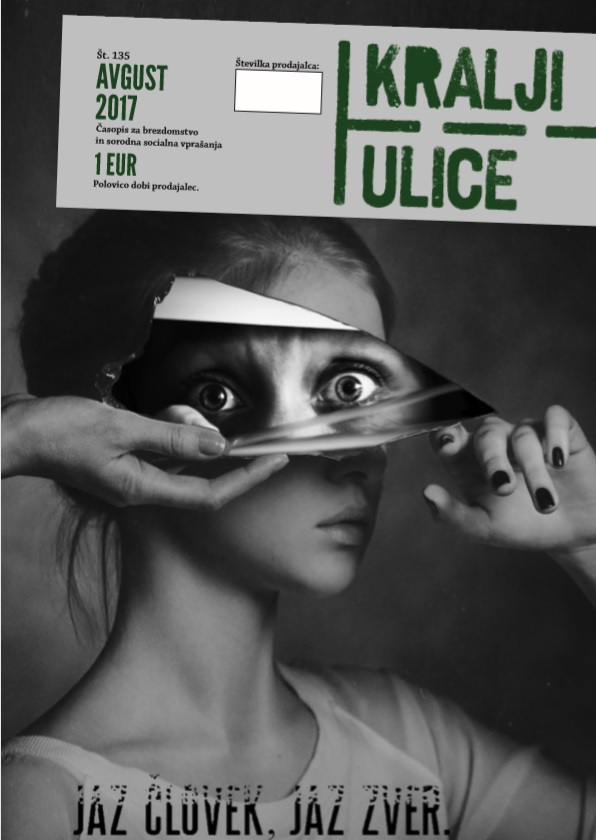
Kralji Ulice said: There are many conflicting forces within us lurking in the shadows. Can we actually recognise and accept the so-called moral duality within our own personality? Is there a stranger we know living deep down our soul? The cover is supposed to get the people thinking about their moral and value conflicts. We’ve all got them – no doubt about that. We are trying to get the readers ask themselves if they engage in moral and value judgement enough to ensure the uprightness of individual conscience.
3. Lice v Lice, Macedonia
Refugees in their own country
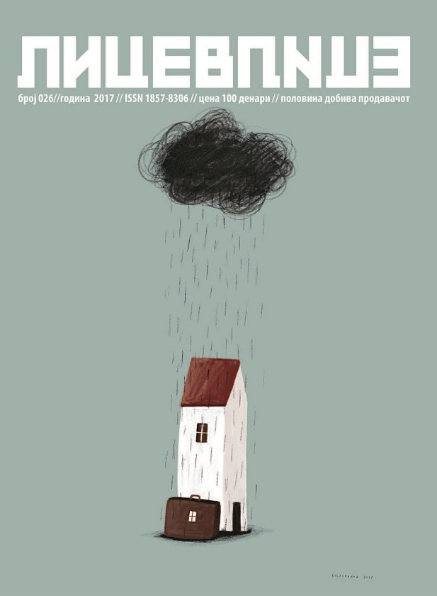
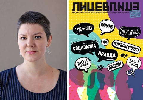
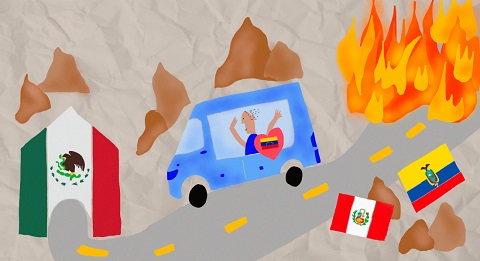
Lice v Lice said: In light of the world refugee crises, smaller migration flows are threatened to get unnoticed. Looking for better opportunities, families sell all they have and head toward Europe. Being over-fed with migrants struggling for life, these group of migrants are forced to come home. Basically, to nothing. What are the mechanism to reintegrate these people? Which social services are offered to reanimate socially wounded family? Where do they start, their new life in an old country? These issues were tackled in the issue dedicated to returnee migrants. “Once you lose your home it seems like you lost everything you had. When that happens twice, it’s a nightmare”, says Vane Kosturanov, the prominent Macedonian artist behind the cover. The cover, brilliantly capturing the emotion behind the phenomenon tells a story of a travelling home. The unexpected cloud of obstacles follows you all the way.
4. Mi Valedor, Mexico
Edad de Oro
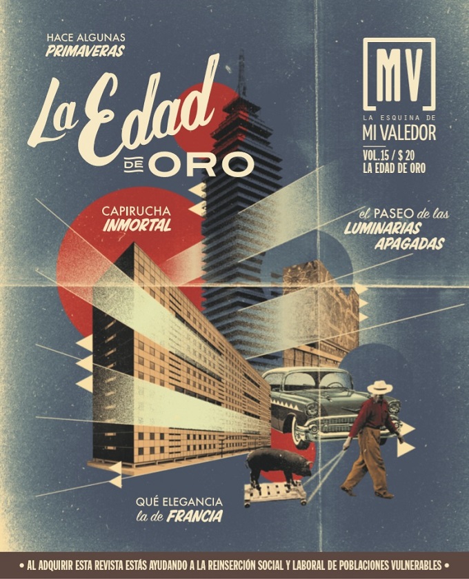
Mi Valedor said: This issue was an homage to the golden age of Mexican cinema (1936-1959), a glamourous era when the film industry held great importance throughout the world and brought economic prosperity to the city. The elements that appear in the collage are the Torre Latinoamericana (Latin American tower) which was built in 1948 and was the tallest tower in IberoAmerica at the time; an apartment complex designed by Mario Pani (city planner and architect who was influenced by Frank Lloyd Wright and designed the most emblematic buildings in the city) and Ciudad Universitaria (University City) (built in 1950 and now a UNESCO world heritage site); and a photograph taken by Nacho López, the most celebrated photographer of that period, who was known for his photo journalism and for photographing daily life in Mexico City. The colours, fonts and design elements hark back to these years of elegance, prosperity and artistic care. It was a highly relatable and nostalgic experience for the reader as it is an era that all Mexicans are familiar with. Thanks to this cover, it was our best-selling issue to date!
5. Nový Prostor, Czech Republic
Urban Settlement
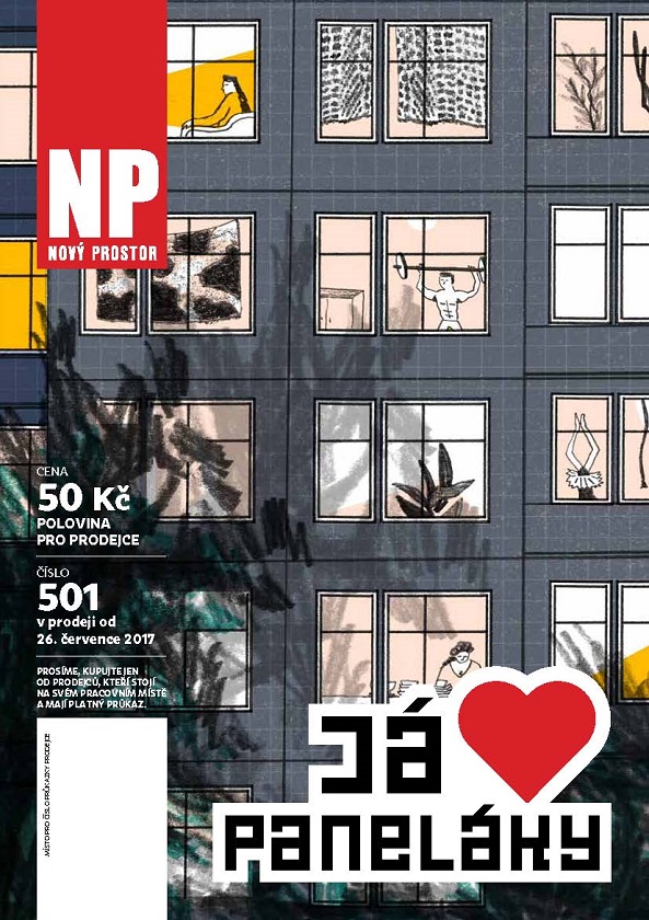
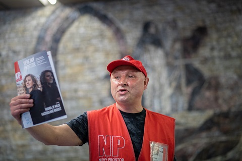
Nový Prostor said: An issue dedicated to panel flat houses, a form of urban settlement typical for most of the post-communist countries. Cheap blocks of flats are still the home of 25% of Czech people – we call them “paneláky”. Once a place of depression and isolation is changing into a vibrant place to live. The headline reads “We love paneláky”, and this issue was one of the best-selling issues of 2017, showcasing the work of a very talented young illustrator called Nikola Logosova.
6. Shedia, Greece
Sex Education
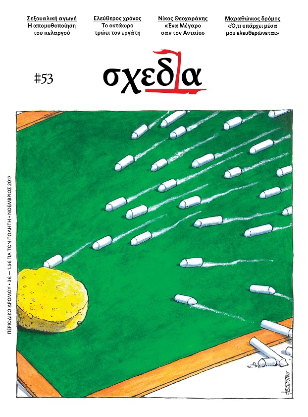
Shedia said: Sex education is still treated like the “forbidden fruit” within the Greek education system. It was our feature story at the beginning of the current school year (November 2017), as we reported on educational systems all over the world (most notably the Netherlands) where sex education is an integral part of the curriculum and having great positive impact on students and society. We hope to see changes in the way people in power in Greece think about this important issue.
7. Shedia, Greece
The Loneliness of a “Like”
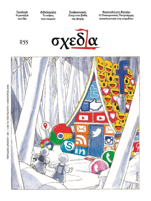
Shedia said: Michael Kountouris’ cartoon is inspired by the famous fairy tale Hansel and Gretel. Only this time, the witch house is not full of candy and chocolate but full of social media applications. Hansel and Gretel were promised “soft beds, delicious food and a hot bath”, just like social media users/addicts are promised a new life, a new circle of friends, an escape from loneliness. It is all a deception.
8. Surprise, Switzerland
End of Broadcast
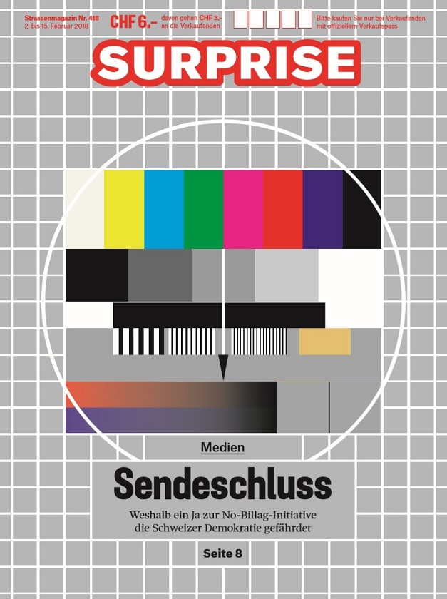
Surprise said: For quite some time in 2017/2018, Switzerland was discussing the future of its publicservice broadcasting. An ultra-liberal initiative called for the abolition of the radio and television licence fees, the so-called Billag fees, and caused a nationwide discussion about the importance of public-service media, its flaws and deficiencies, and the implications for several independent media initiatives and small minority language programmes. The initiative was finally buried by over 70% of the voters voting “No” on March 4th. Our cover story featured an analysis of the possible outcome of the initiative by Robert Blum, a well-known expert for the Swiss public-service broadcaster. The cover was inspired by the old test screen on television which you could see after the programme had ended before television became a 24/7 business. The headline is “Sendeschluss” means “End of broadcast” and pointed to the consequence if people would have voted “yes” at the ballot.
9. The Big Issue Taiwan, Taiwan
Growin’ Up
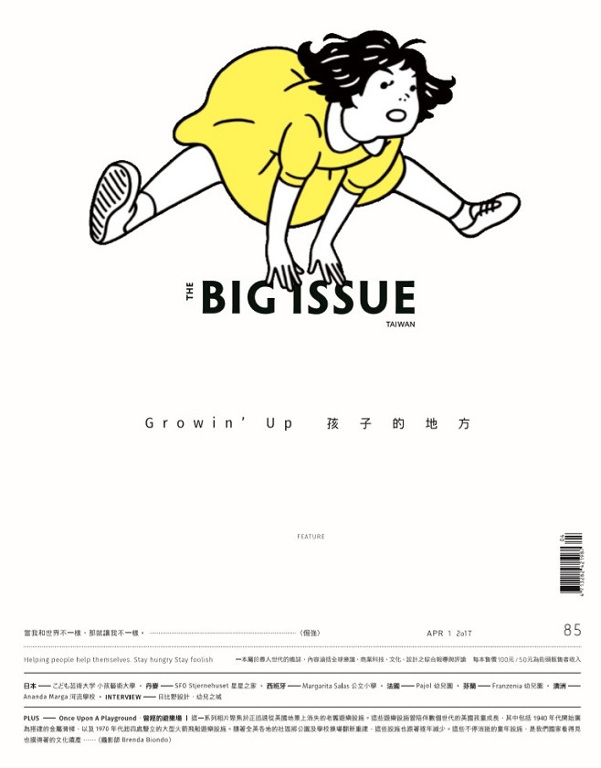
The Big Issue Taiwan said: Illustrator Nimura Daisuke conveys the sense of uncertainty and cheerfulness in the process of growing up through this bold illustration. The vivid colour and simple background of this cover expresses the purity and energy of the younger generation and at the same time successfully grabs attention from passers-by. In this Growin’ Up issue, we explored how growing up could sometimes be a sudden transformation of mind. It happens when a people take a leap inside their heart, a leap of courage, a leap of curiosity, a leap faith. The leap starts their story and thus make them stronger and better.
10. The Curbside Chronicle, USA
Mission to Mars
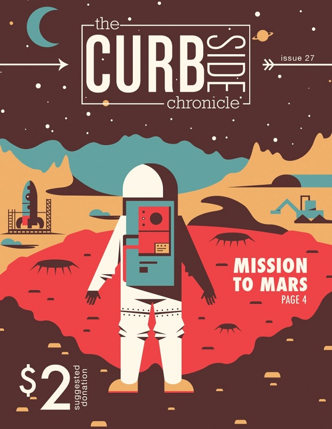
The Curbside Chronicle said: Our Issue 27 featured a visually appealing depiction of a man on Mars. The illustration was attention grabbing and related to one of the issue’s features: an interview with a Mars One participant who hopes to set up the first human settlement on Mars.
Take a look at the nominees we’ve already announced in the Editorial categories for the INSP Awards 2018, and use the hashtag #INSPAwards on social media to congratulate our nominees!
