Best Cover is always one of our most hotly contested INSP Awards, and this year is no exception, with a record 78 entries in this category from street papers around the world!
The Best Cover Award recognises a cover design that has had a big impact on the street, whilst effectively telling a story. The front page should be striking – grabbing attention from passers-by and drawing them to buy the publication.
Our top ten, featured below, will now go forward to our editorial shortlisting panel, who will choose the five finalists. These will be announced in early June, and the winner will be revealed at the Global Street Paper Summit in Hannover, Germany.
The Nominees:
1. =Oslo / =Norge, Norway
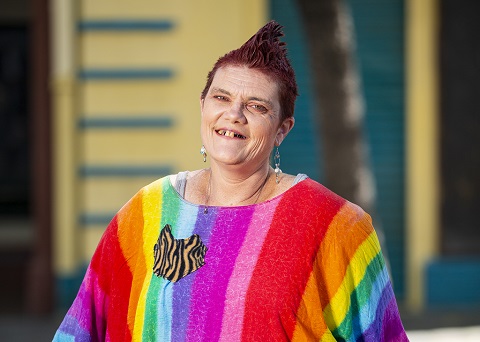
To lose face
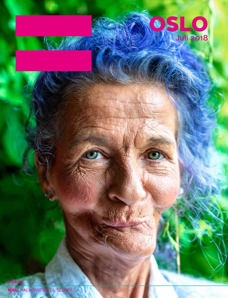
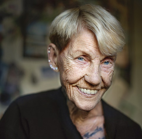
=Oslo / =Norge said: Turi Tingelholm is a cancer survivor, living in Oslo. She was diagnosed with cancer in her jaw in March 2009. After being treated with large doses of radiation, her jaw was seriously damaged, and she went through countless surgeries and transplants to reconstruct it. Turi went through complications and also depression after the ordeal, but has now found a new lust for life at the age of 60. The, blue haired, youthful and outspoken lady talked to us about what it’s like to literally lose face.
2. bodo, Germany
Airy Heights
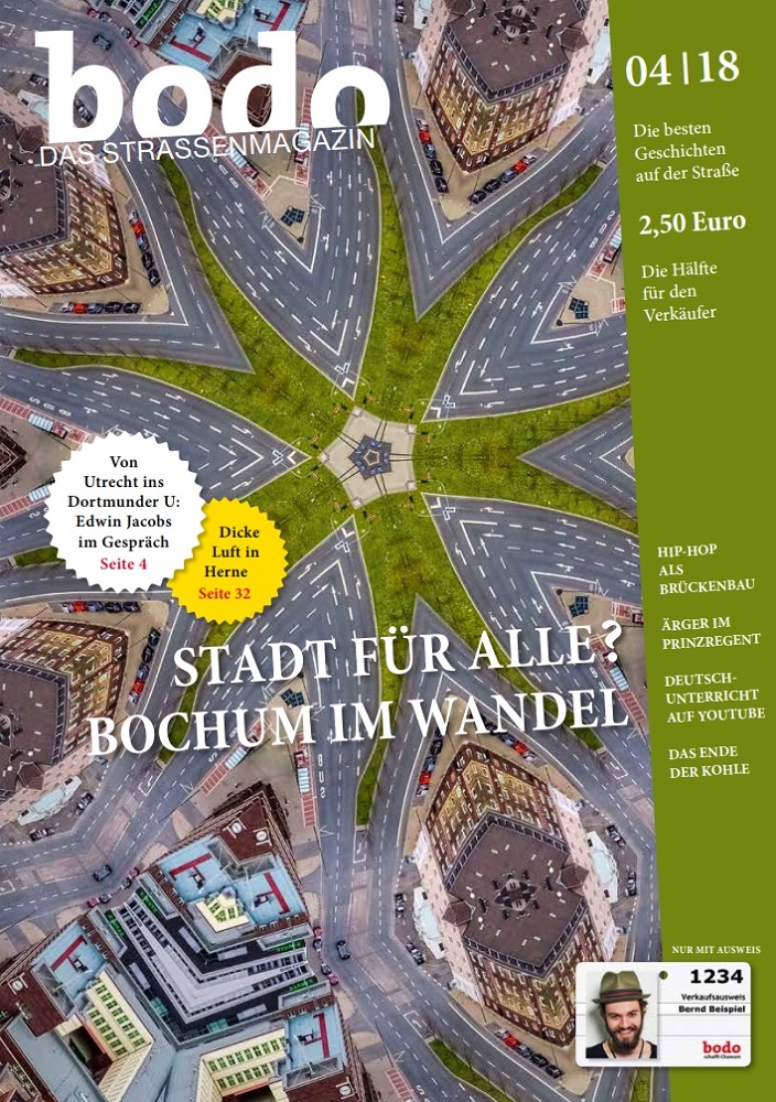
bodo said: For the cover of our April 2018 issue we went to airy heights. We photographed the city centre of Bochum from the roof of the “Excenterhaus”. Based on these photographs, our graphic designer has made a creative cover that refers to an interview with the initiative “City for All”. This initiative is concerned that there will soon be no room for people with little money anymore – and has ideas about what urban development processes might look like.
3. Faktum, Sweden
The take-away catastrophe
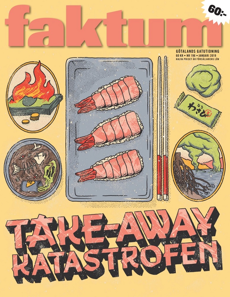
Faktum said: Being a magazine fighting not only for a better world for everyone, but also for a world that will exist for the next generations, Faktum occasionally dig into environmental issues. In this edition we decided not to trust the sushi-shops anymore, saying that they don’t buy and sell red-listed giant shrimps. Since many of us can see what they do, we decided to check on them with a phone call, to find out. Our suspicion was that maybe many of the workers in the Swedish sushi-bars, that barely can speak Swedish, might not know what kind of shrimps they sell and what is correct or not to do. The cover we made on this magazine, illustrated by artist Andreas Pedersen, shows the result in one word: catastrophe. But it also covers the big picture of this, the worldwide big business with these shrimps that are not only giant themselves – but also a giant environmental problem.
4. Hinz&Kunzt, Germany
Please do not drown more!
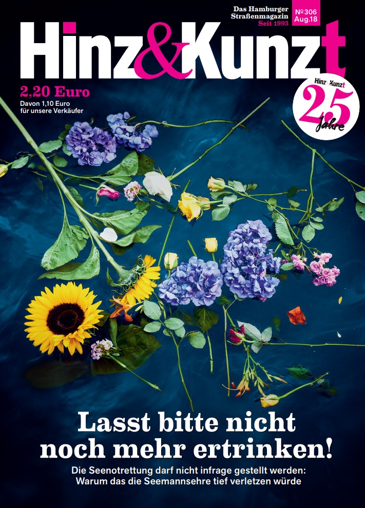
Hinz&Kunzt said: As we were preparing the issue, different European states were just beginning to obstruct private maritime rescues, showing a willingness to accept that refugees are dying in the Mediterranean. In Germany, there have been discussions as to whether private maritime rescue is legitimate or not. We were hardly able to bear all this, and wanted to make a statement with our title: Please do not let any more people drown! Things that should have been self-evident were no longer seen as such. The cover picture by Dmitrij Leltschuk was taken at a demonstration for emergency maritime rescues. An activist had thrown the flowers in the Elbe as a sign of sympathy for the refugees who had drowned in the Mediterranean. For us, it was a simple but powerful image that underlines our almost desperate plea, alluding to death but not showing it directly. We wanted to convey to our readers the dramatic nature of the situation in the Mediterranean, without shocking or frightening them. The magazine features interviews with a ship’s priest and a shipowner about the drastic situation in the Mediterranean.
5. L’Itinéraire, Canada
Love and sex: a question of taste
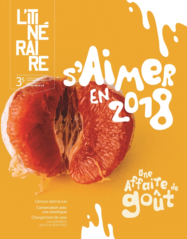
L’Itinéraire said: This evocative cover appealed to a wide audience. The theme of the magazine was the many forms of love and sex in our society. The title was “Loving in 2018: a question of taste”. Since we didn’t want to be too explicit and shocking, we chose to be suggestive instead. Isn’t this the sexiest grapefruit you’ve ever seen? The colourful orange cover with the splashes of white and corresponding lettering is “dripping” with sexual overtones, without being tasteless. That got our vendors and customers talking. What is more symbolic of sex? A juicy grapefruit or a picture of an overly made-up young half-dressed girl in a provocative pose? This was just one of the topics of conversation relating to this cover. This December 1st issue sold out completely. Even the Montréal media (radio) commented on it.
6. Street Sheet, USA
Shelter
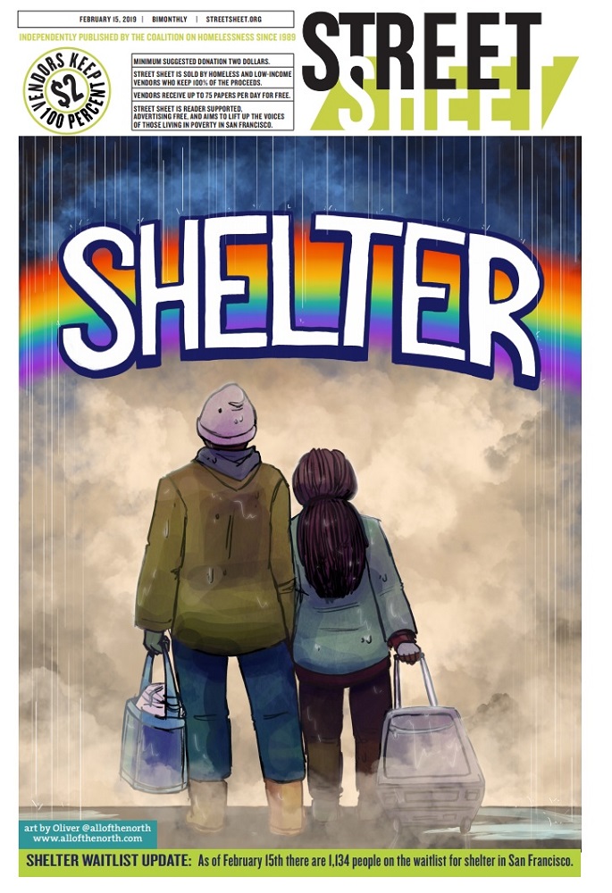
Street Sheet said: Oliver Northwood’s glorious cover graced our recent shelter-themed issue. In the past year alone, Northwood has won acclaim for his covers and a graphic interview with staff from the Coalition on Homelessness, the paper’s parent organisation. This illustration for the 15 February 2019 issue shows a homeless couple standing in the rain and toting their bags while looking at a rainbow with the word “shelter” in the distance. It’s as if they’re looking a port in the storm and a place that offers acceptance. This illustration will also be on tote bags for Street Sheet vendors to carry their papers.
7. The Big Issue Australia, Australia
Turning the tide on plastic: Australia’s answer to the world waste crisis
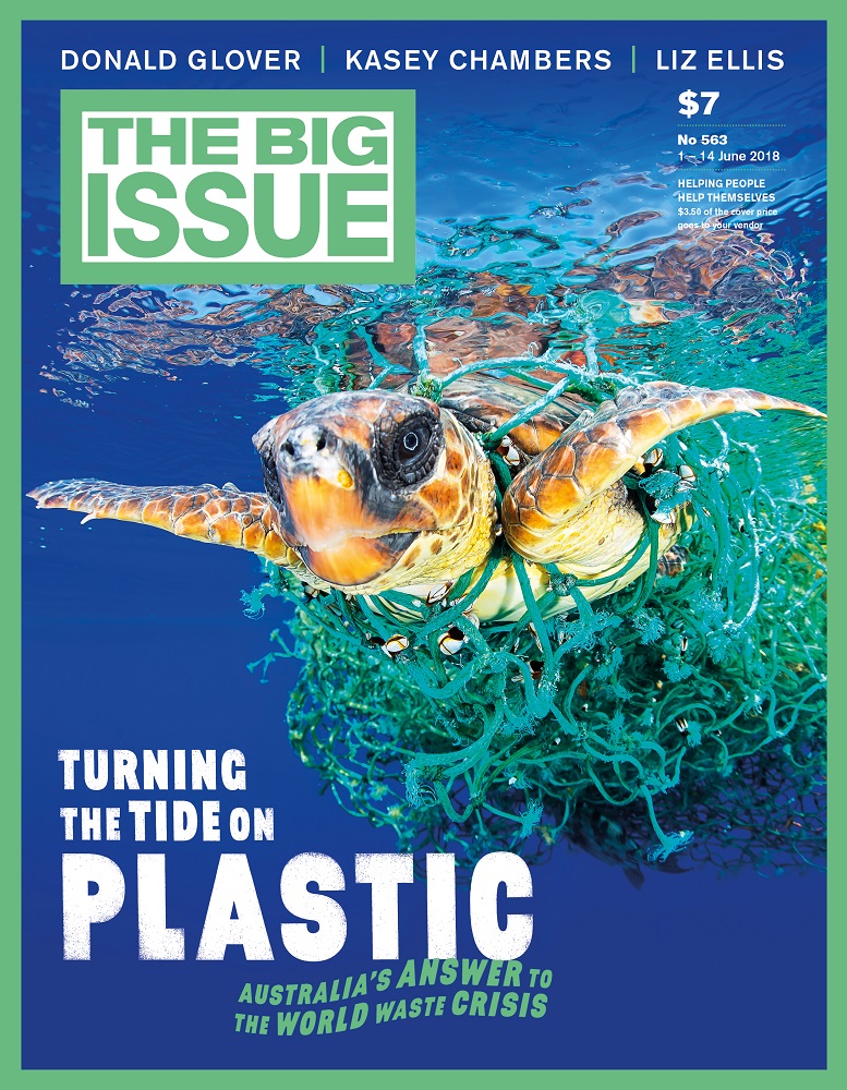
The Big Issue Australia said: A loggerhead turtle stares out at you from its plasticky trap, and seems to ask the question: “what do we do with all of our plastic?” This thought-provoking cover was designed to achieve maximum visual impact. We wanted to pull no punches in showing the consequences of the global plastic crisis. It tapped into the zeitgeist just as China placed restrictions on its importation of recycling waste from several countries, including Australia. Sales were up 2% on the previous edition, and 6% on the following. Vendors reported more passers-by stopping to chat about the cover. We recalled this striking image from the World Press Photo Contest, and reached out to photographer Francis Pérez, who waived his fee. He snapped the turtle on Spain’s Canary Islands before untangling it from abandoned fishing nets: “I’m trying to say there is hope. This photo shows an animal that could be saved. We are living on a ticking time bomb, but we are on time.” We used a green palette to emphasis the environmental focus. The cover-line font is simple and bold for legibility on the street; the wave-like secondary font reflects the underwater image. The cover was replicated by The Big Issue Korea.
8. The Big Issue Korea, South Korea
Korean Language’s Day
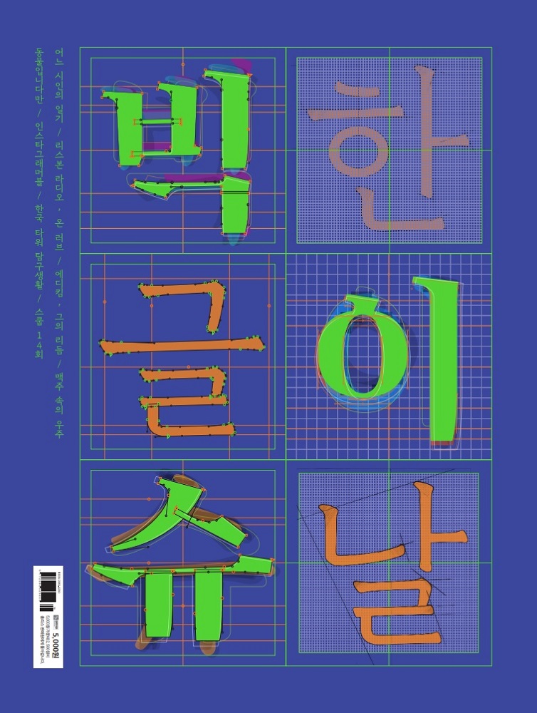
The Big Issue Korea said: Korean Language’s Day is for celebrating the historical event of our language being created for the first time in South Korea. We created our own original design made with the typography of Korean words. The key parts of this design are, firstly, we put the Korean words ‘Big Issue’ and ‘Korean Language’s Day’ like a crossword, and secondly, we put the neon colour on the typography, so people on the street could see the magazine more easily. Thanks to the promotion from K-pop idol Exo, this edition was sold over 35,000 copies in two weeks. It was one of our bestselling editions so far.
9. The Big Issue, UK
Trump – Flake News

The Big Issue (UK) said: Our cover is key – an advert to tempt passing trade, people on the street who may not even want to look at a vendor and give an immediate flavour of what is inside. Our vendors depend on this to make their living, there is huge responsibility to get it right. We frequently tread a line between politics and popular culture, always have to say something with the cover and really need, if possible, to make it bright and funny. In a period of lethargic sales, this connected and flew. It says who we are, what we think and raises an immediate smile. We were in the grip of a heatwave; the hottest summer for years and the week that Donald Trump was visiting the UK. We wanted to show our readers we understood their issues with Trump, and that we were going to address his Fake News narrative inside. We settled on the image and the coverline presented itself. The cover appeared as placards on anti-Trump protests from London to Glasgow, and a tea-towel version became a best-selling item in The Big Issue Shop, feeding back in to our core mission.
10. Z!, Netherlands
Sorry for everything
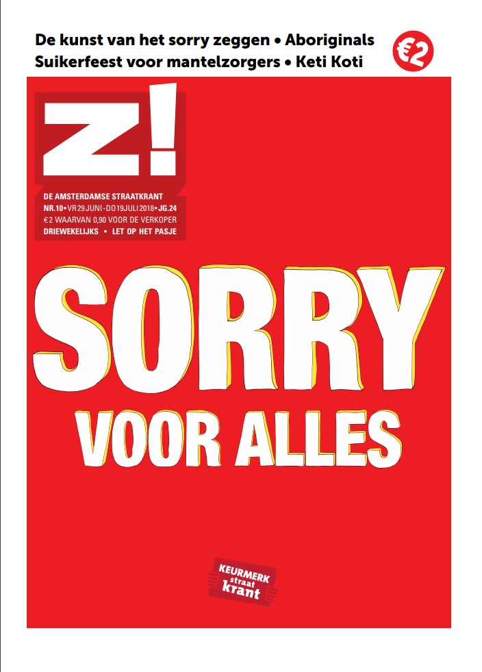
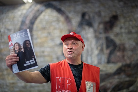
Z! said: Sorry for being in your way, sorry for trying to sell you a street paper, sorry for confronting you with homelessness, sorry for everything! In this edition we dive into the topic of apologising. Who says “I’m sorry”? When? How? And why? The issue covered differences between men and women, apologies for slavery and racism, the things our vendors regret and the need they sometimes feel to apologise for selling the street paper. We chose a bright red cover with the text ‘Sorry voor alles’: ‘Sorry for everything’. The text immediately grabs the attention of anyone passing by, makes them reflect, linger and have a conversation with the vendor about the topic. The fact that this cover made people stop was also reflected in sales numbers.
Take a look at the nominees we’ve already announced in the Editorial categories for the INSP Awards 2019, and use the hashtag #INSPAwards on social media to congratulate our nominees!
