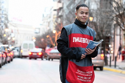
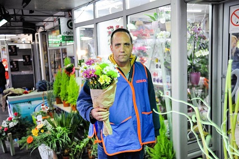
The countdown is on for this year’s INSP Awards, and today we’re announcing the nominees in the Best Design category.
The top ten are listed below, and will go forward to our international judging panel who will choose the finalists. The finalists will be announced in the coming weeks, ahead of the Global Street Paper Summit – where the winner will be revealed.
We’ve already announced the longlists for the Best Cover and Best Cultural Feature, and the nominees for our other editorial categories will be following later this week.
The nominees:
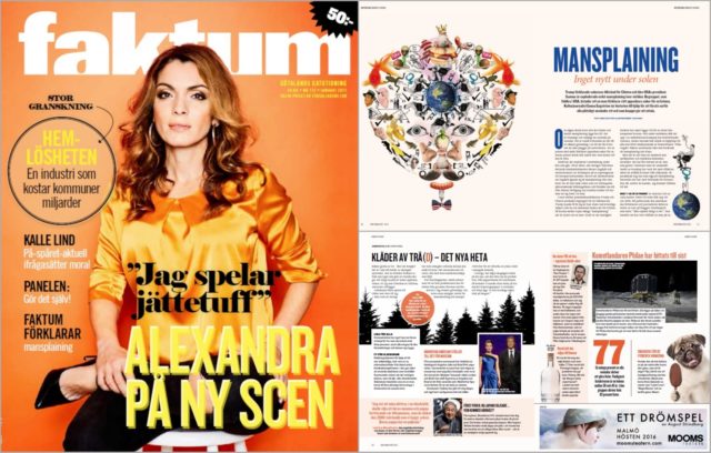
“When we set the design, we use colours and illustrations to make journalism and information about hard issues more accessible to the reader without deterring people from the buying the magazine. The design’s objective is to harmonise the mix and scope of the content.”
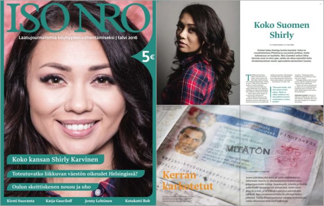
“The content of the magazine aims to be a highly competitive cultural magazine. We care about our paper stock and the quality of the pictures. The graphic concept for the magazine is done by Daniel Forsman, Henna Kokko and Lea Pakkanen, and the magazine is combined by our regular art director Elisa Bestetti. For every magazine we do our own infographics.”
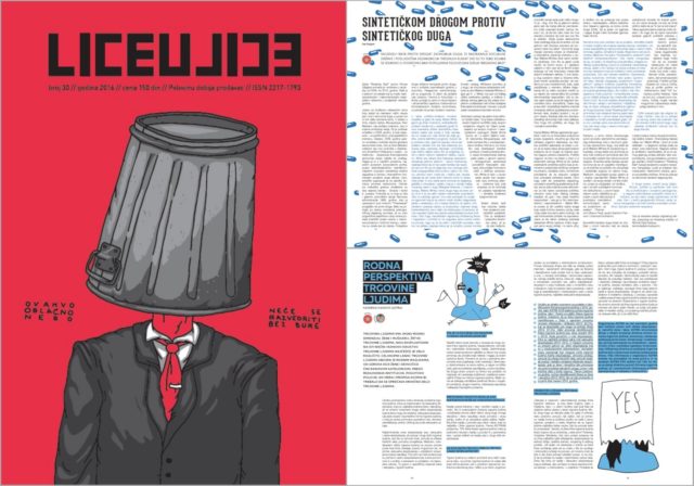
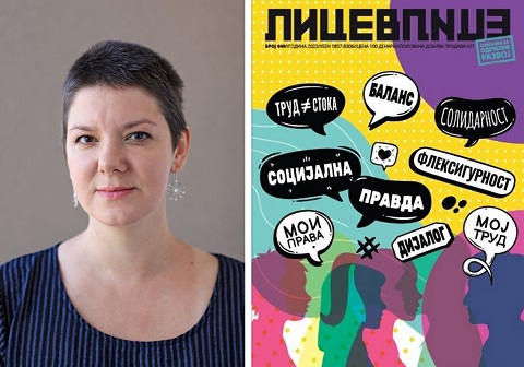
“Visual identity of the magazine is very important to us from the very beginning. We developed voluntary cooperation with young, unknown designers from all over the Balkans, and for the majority of them this was their first job of this kind. Every magazine is designed by different designer (or group of designers), under supervision of our Art Director (Sanja Polovina).”
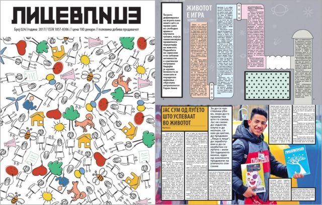
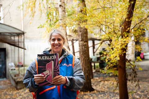
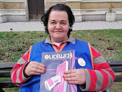
“The design of our street paper (by Zoran Inadeski) gives an authentic showcase of problems resolved in each edition. All the illustrations are delivering the message soundly, giving the issues not only its visual form, but also, asking for participation and further problem solving. Sometimes detailed, other times minimalistic, it is consistent in its essence – delivering the mission of Lice v Lice.”
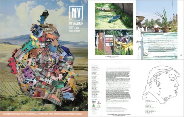
“Mi Valedor is a themed magazine which aims to be understood by anybody living in Mexico City. We search for a design which reflects the identity of the streets through images, illustrations or texts. Although we need a clean design, we need to stand out like a quality collectors piece.”
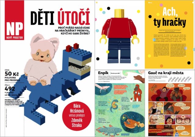
“We’ve decided for a simple design, bright, light and well-arranged. Not too classy, not too mainstream, not too experimental. It is balanced but not faceless. Linear, straight but not cheap or manipulative. We decided to give space for an original photos and original artwork from young Czech illustrators and designers.”
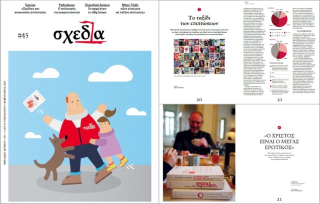
“On Shedia’s 4th anniversary (February 2017) Shedia hit the streets of Athens and Thessaloniki in brand new style. Our aim was to further enhance the high profile and the unique character of the paper, while, at the same time, preserving its core philosophy, its humane approach and directness of information.”
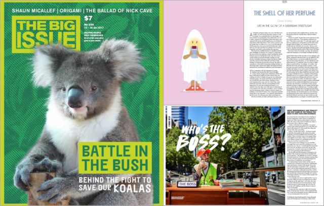
“Our mission is to continue to create a vibrant and interesting publication that engages readers and generates greater income for our vendors. To this end, we are committed to original illustration and photography, augmented by strong design and typography.”
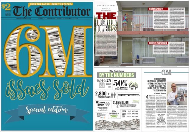
“We value the compelling and important content in our paper, so intriguing design is a key part of the conservation in our office as we produce a weekly paper. From hard news to features to entertainment, we are always trying to showcase stories in a way the readers won’t anticipate.”
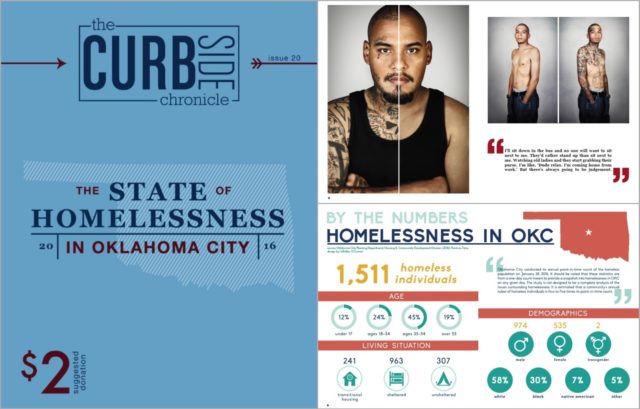
“Our design is meant to highlight our vendors and their contributions to the magazine, from movie reviews to photoshoots. We emphasise visually appealing content through the use of large images, custom infographics, and colourful design elements. Over the past year, we have worked hard to refine our design and the layouts for our evergreen content, making the design stronger and more consistent.”
Don’t forget to keep checking back this week as we reveal more nominees for the 2017 #INSPAwards. Take a look at the nominees we’ve already announced here.
