By Brian (Ming-chang Huang), The Big Issue Taiwan
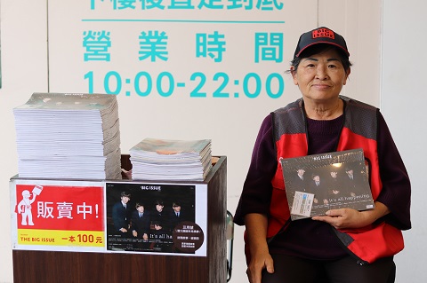
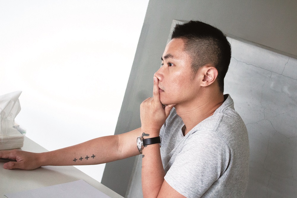
Last night, at the 2018 INSP Awards, The Big Issue Taiwan was victorious in the Best Design category. Part of their win can be put down to the work of Aaron (Yung-chen Nieh) who, remarkably, designed 95 out of the last 100 covers of the street paper. His contemporary and stylish designs have endowed the covers of the magazine with a unique visual style that has not only proved popular with readers, but which has also attracted a great deal of attention from professional designers. For the magazine’s 100th issue, Aaron shared his insights regarding how to design an effective front cover and talked more about his work with The Big Issue Taiwan.
The Big Issue Taiwan: How did you first become involved in designing front covers for The Big Issue?
Cover designer Aaron (Yung-chen Nieh): It was before I headed to Los Angeles in 2009 that Fines Lee (Hui-Chang Li) [chairman and editor-in-chief of the street paper] called me and asked to meet me in person. He said he was planning to make a magazine: he then introduced me to the concept of The Big Issue and asked me if I could try and make him a front cover. I didn’t know him very well at the time! I didn’t think too much about it, but I designed six different covers, in accordance with some of his requirements and using the materials I had at hand. The six versions were actually designed for different purposes. I measured every picture in a horizontal layout and decided where to put the logo or the title on the basis of the balance of the layout. Some designers always tend to position these elements in the same place, but I think The Big Issue can do it differently because their magazines aren’t sold in bookshops; hence, there are no problems with the logo or title being blocked by other books [on the bookshelves].
Anyway, Fines made a pitch in the UK and one of the covers passed! I didn’t intend to continue in that line of work, so they had Zhi-hong Wang [a Taiwanese graphic designer] design the first three front covers and the fourth one was designed by the The Big Issue’s in-house team. I forget why, but I was back designing covers from issue five onwards – the one about Lun-mei Kwai [a famous Taiwanese actress]. I’m still doing it and we’ve just released the 100th issue! I didn’t expect to be doing it for so long – it feels like my life is tied up with this work infinitely! [laughs]
What are the differences between designing covers for The Big Issue and designing covers for other publications?
Mainly my mentality. The Big Issue is not as popular as many other magazines on the market. To be honest, there’s no magazine of a style similar to The Big Issue available. While everyone else is pursuing “hipster” things, such as coffee shops and bookstores, I find that every topic covered in The Big Issue is more transcendent and that it has a stronger connection to society. Therefore, I am continually enriched by reading the topics covered in the magazine and this inspires me to work harder. In addition, I find it interesting to use artists’ work in different mediums–such as images and illustrations–to accompany writing on different topics and then I make aesthetic adjustments.
Does it have any impact on you that the street vendors are sales channels?
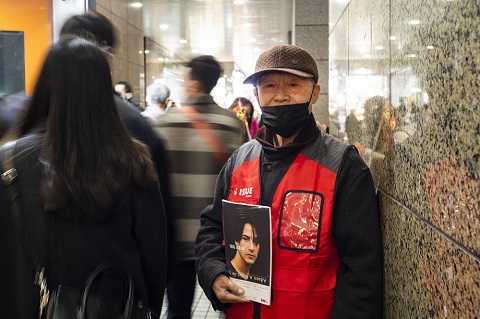
Not really. At the early stage, Fines didn’t really give me any advice. Basically, I just made a cover while observing the reactions of the market and the vendors. Of course, as I continued doing it, Fines started telling me about some of the vendors’ reactions – such as how they didn’t want the cover to be too dark or the people featured on the cover to be too small. All of these things can be adjusted. It’s definitely a good thing to make adjustments if some design issues can’t be conveyed clearly and to influence the messages that readers receive by doing so. After all, it’s not pure art to design magazine covers.
The main material varies from cover to cover, such as photography, illustration and the model cards used. Do you have different design considerations for them?
Not really. To me, it’s all about deconstructing the scene. The edit condition of material is always different. If an illustration is being used, I try to maintain it the way it is as much as possible; if I’m using a photo of a cover person that we’ve taken ourselves, then the image can be used more freely.
Are there any principles to follow when it comes to designing front covers?
My principle is to do my best to make the cover ‘unordinary’. That’s what I’m thinking about when I pick images or decide how to crop pictures. If I’m using a model card that looks very commercial, I’ll try to transform it into a more artistic, unique picture. In fact, the way that you crop pictures is exactly how you eliminate the commercial overtones. Sometimes a picture looks perceptual if only a certain part of it is shown, and that picture will no longer be just propaganda for media use.
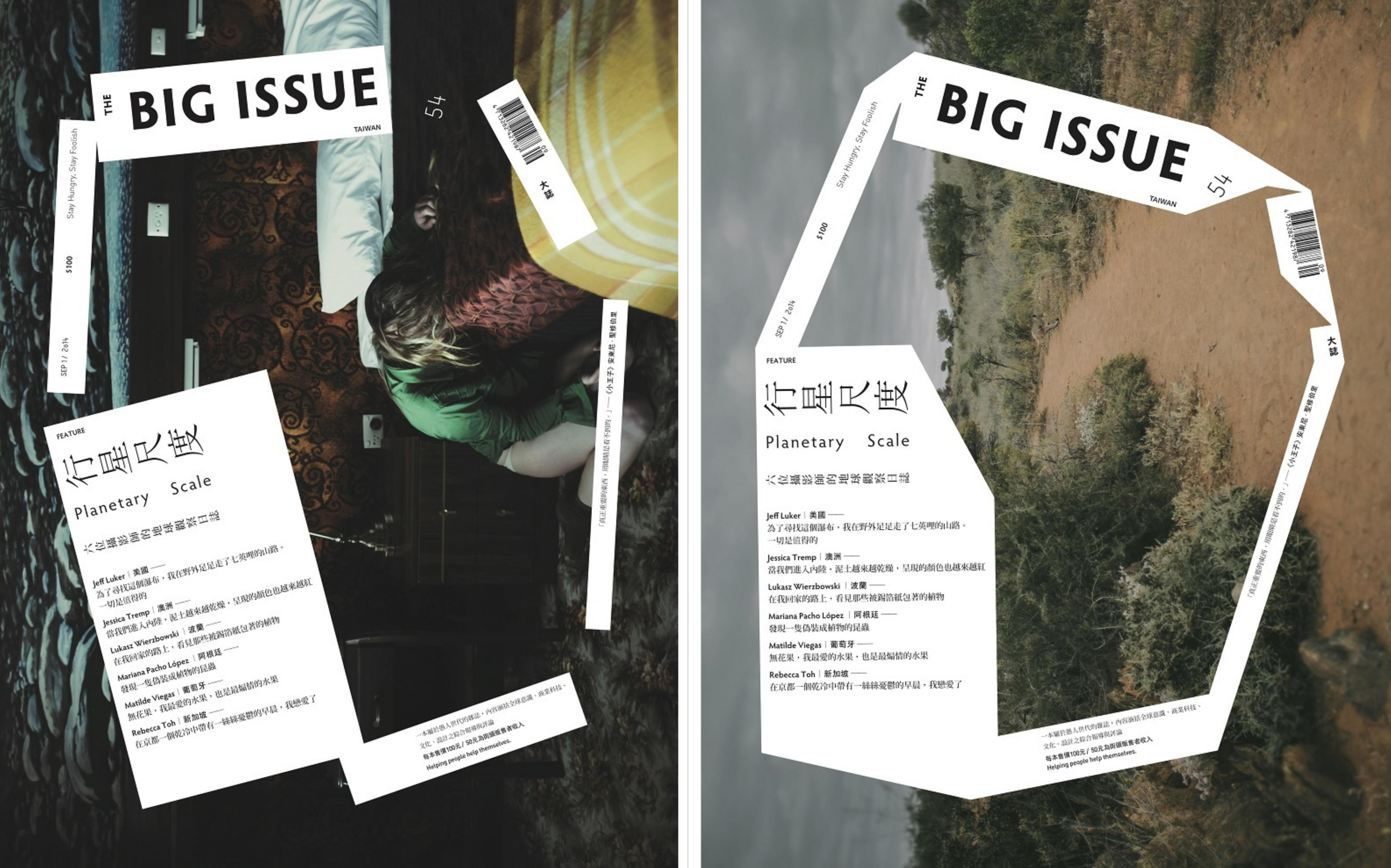
Some people are curious about why the five sense organs [ears, eyes, lips, nose, and tongue] of a person featured on a cover usually appear in cover images. Why is this?
Besides my personal preference, try to imagine if you’re putting a headline on a very well taken portrait photo. The sequence of letters will probably look good wherever it’s put. But if it goes anywhere onto the face, or on the eyes, it tends to cause a kind of “sensitivity,” a psychological reaction, from readers – because sense organs are the most sensitive parts of human bodies, so they get sensed easily, more or less, even if you just print something small on a sense organ of a picture. If you avoid putting the characters on the face, the layout might still be good, but it won’t be the most felt.
Could you briefly share your process of designing a cover?
I am pretty much always in a rush! [laughs] Before I receive the material for the cover, I already have some plans in my mind. Under very rare circumstances, I’d offer two versions for you to pick from and that’s because I love both of them very much. In most situations, I design the covers and–in most cases–I decide which version is better, and then I finish that one.
The Big Issue’s logo was changed slightly from the 42nd issue onward. What was your motivation for doing that?
The original logo looked foreign, but not completely. [I might have changed the logo] because I got tired of it after some time, or because my taste had changed and I found it a little old-fashioned. I happened to see the logo used for The Big Issue Korea and thought that it was more modern with great color matching, so I mentioned changing our logo to Fines. Logo type has a huge influence on a magazine’s layout and no matter the materials, the type of logo used is important. Therefore, I created some new logo types. Some were similar to the order of the old one, others were in new orders, and others were laid out horizontally. The horizontal ones were useful, so they’ve been used more often. I always consider which logo suits the material best before deciding the cover layout.
After designing front covers for nearly eight years, do you think the style of The Big Issue has changed?
No, I don’t think it’s changed a lot. Maybe it’s because it’s constantly changing, and every magazine looks different, that it looks pretty well-balanced on the whole. In Taiwan, there doesn’t seem to be any other magazines that greatly change from issue to issue; most have a set style.
Which front cover do you think was the most impressive?
“Planetary Scale” [featured in the 54th issue]. I was very open-minded about the process of designing the cover since I found it very poetic and different from the logic that shaped other layouts. In fact, I wanted to make it distinguishable even if a reader just saw the words “Planetary Scale.” Of course, the photos by the photographer Jessica Tremp were awesome too: designing the cover gave me a chance to respond to her thoughts.
Are there any cover photographers or illustrators that you’re been especially impressed by?
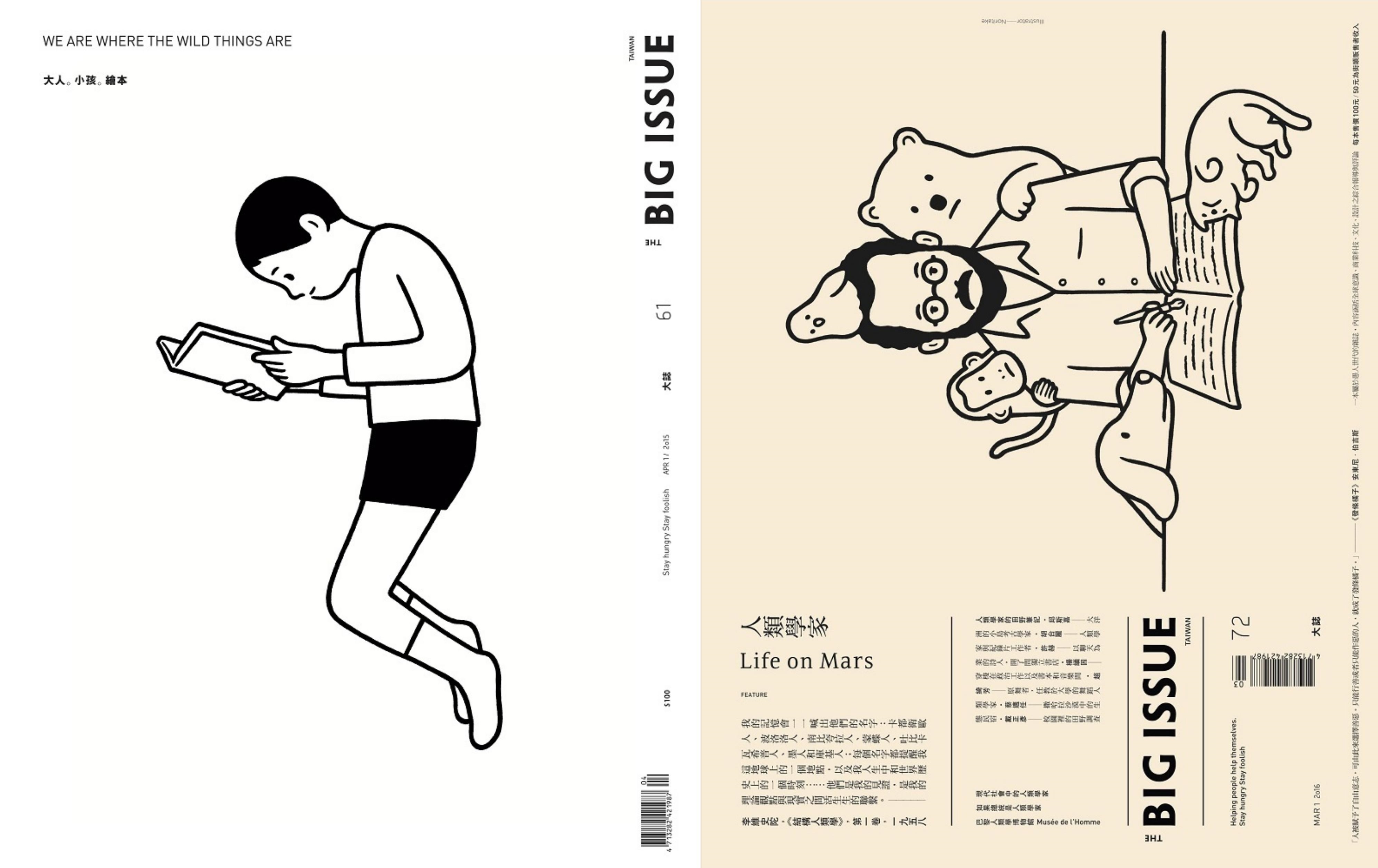
This question is a curveball, isn’t it? Very hard to answer! [laughs] Every creator has their own characteristics and the materials are always a surprise when they come to me. Putting aside my own preferences, Noritake is very memorable because his work is very minimal, so covers made using his work are always minimal. His work is really calming. I often see posters that show him working with The Big Issue [for example, on the 61st issue] in coffee shops… Ah, “Life on Mars” [the 72nd issue] is also very nice!
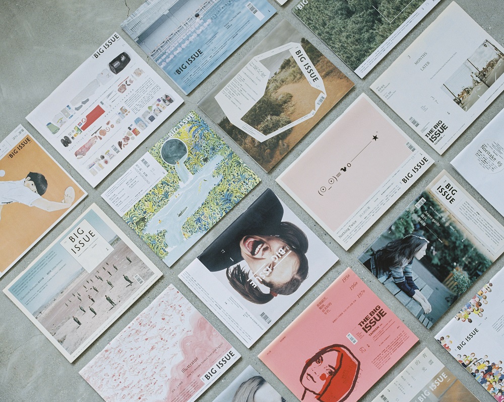
The Big Issue Taiwan has just celebrated the release of its 100th issue. Have you encountered any obstacles in the past, in terms of design? Are there any design techniques that you’d especially like to try in the future?
I have used special colors for some covers and I think it would be nice to do this on a regular basis. Colors are a crucial element that can be played with. As for the obstacles that I’ve faced, I’ve had very limited time to complete a few covers. I’ve finished about 20 covers while working abroad out of the 96 covers that I’ve designed. Sometimes I work alone against the clock in a hotel. This is nearly the only project that I work on regularly and long-term. Fortunately, every topic covered in The Big Issue and the material included in each issue is pretty interesting. As the environment changes, new [design] trends will pop up, that’s for sure!
***
Aaron Nieh
As the founder of Aaron Nieh Workshop and a member of Alliance Graphique Internationale (AGI), Aaron first showed his talent through words before getting involved in image displays that allowed him to showcase his unique powers of observation. His subtle way of processing details and his ambitious, provocative visual style have given new depth and meanings to Mandarin pop music, books, publications, art and cultural exhibitions since 2002. Since 2009, Aaron’s added more interpretative layers to his work by skillfully and calmly working with scenes, symbols and various materials, thereby opening up new perspectives by which audiences can appreciate and understand visual graphics. aaronnieh.tumblr.com
Translated by Sunny Tseng (Taiwan)
