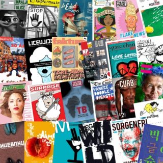
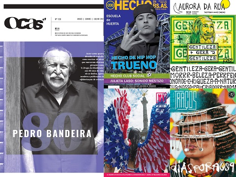
As the 2019 INSP Awards approaches, we’re pleased to bring you the Top 5 Finalists in Best Design.
This award acknowledges excellence in street paper design. Judges look for a design that is dynamic and original, high quality, appropriate, and relevant for the audience, as well as supporting the mission of the street paper. You can see the Top 10 nominees here, which we announced in April.
Our shortlisting panel have narrowed down the Nominees to give us Finalists, who now go forward to the main judging panel to select the winner.
Winners are revealed during the INSP Awards Ceremony held as part of the Global Street Paper Summit in Hannover, Germany, on Wednesday 19 June.
We’ve also launched the People’s Cover Award voting, where – for the first time – the public have the chance to choose an INSP Award winner. Cast your vote now!
The Finalists:
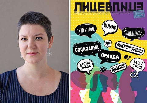
1. Lice v Lice, North Macedonia
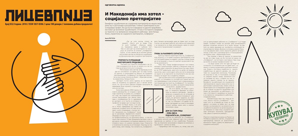
Lice v Lice said: Parenting, Blockchain and Sustainability. Three different, challenging themes that were main topics of three of our editions. The design of all three is with the same style, visually appealing, educational and in a way challenging. Colourful, with illustrations that follow the story and give an extra view to the readers, our design is equally interesting for our audience and for our vendors. With smart solutions, each edition gives a precise theme and it is done with colourful illustrations, column placement and it is playing with the forms inside the text. Clear, impressive, bold and unusual for a printed media in Macedonia, but even broader, the design of our street paper is one of its trademarks, which along with the content, the mission and the work of the vendors is paving the road to a better world to us all. Designer: Zoran Inadeski.
2. Mi Valedor, Mexico
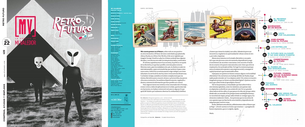
Mi Valedor said: Mi Valedor is a timeless and collectable item. It has been carefully created, like a work of art. The content revolves around one chosen theme and from there we make decisions about the layout and design, as well as fonts and other aesthetic elements. The illustrators who are invited to contribute to each edition are selected because their style has a connection to the theme. The photographs taken of everyday life in the city are vital to the design: they make up 70% of the content. They also support our editorial mission: to create an affinity between people living in the city and those living on its streets, and to break down demographic barriers between people who come from very different socioeconomic backgrounds. The theme of the Retro Futuro (Retro Future) edition is ‘The Eighties’: it shows the future that people imagined in the past. The illustrations by Dr. Alderete, a renowned artist associated with the Latin American rock scene, are in 3D and include references that go from rockabilly to science fiction. The Gran Tenochtitlán (Great Tenochtitlan) concept was inspired by the pre-Hispanic influences that still permeate the city today. The colour scheme for this edition features the primary colours used by the indigenous Mexica people to make natural dyes. Jungla de Concreto (Urban Jungle) emulates the layout and design of National Geographic, to give the magazine a touch of this internationally-beloved publication.
3. Sorgenfri, Norway
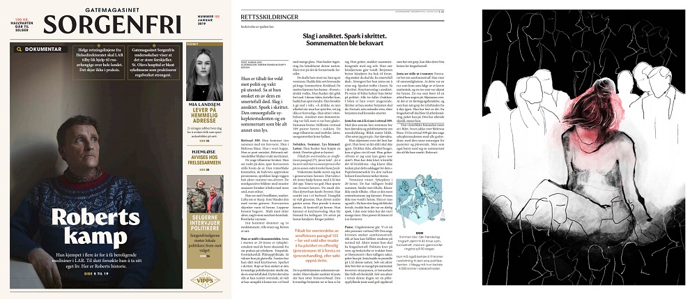
Sorgenfri said: In January 2019, Sorgenfri came out with a new design and new journalistic focus. In the new Sorgenfri, you will find critical and investigative journalism with a focus on drugs, mental health, crime and/or homelessness. We now only publish stories that is about these themes – because these are linked to our vendors situations. We feel that this is an important direction for a street magazine. As a street magazine we are the only press in society that is that close to this group of people. And who needs investigative journalism more than the most disadvantaged people in our society, that have no voice? Our goal is to create debate and set the agenda within these fields, as a consequence of thorough journalism. We want to produce a high-quality product the vendors can sell – and at the same time be able to create debates that could lead to a positive change for their situation as a group. Our focus on investigative journalism is the reason behind the new design. The design is aiming to give the buyers a feeling of thoroughness, credibility and seriousness. Each month, you will find a big, thorough piece on the cover.
4. The Big Issue Korea, South Korea
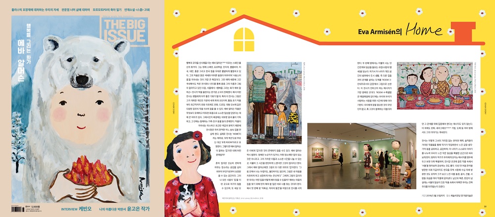
The Big Issue Korea said: These are three of the strongest magazines from The Big Issue Korea in the past year. The first issue is about the summit between South Korea and North Korea. It was historical event, both presidents met on the border line for the first time. We put an illustration of that scene on the cover, and related designs and articles about our history of separation inside the magazine. The second issue is about Fantastic Beasts. The Harry Potter series is hugely popular, so we collaborated with Warner Brothers and put the movie poster on the cover and the design of Newt’s suitcase and the Fantastic Beasts dictionary in the articles, so readers can feel like they’re opening the books from the movie. And the third issue is about Eva Armisén. She is a painter from Spain who fell in love with South Korea. She drew lots of paintings about love, family and South Korea. We put her painting as the cover image and articles with the design of her paintings in the style of a fairy tale book.
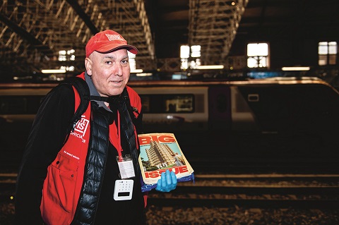
5. The Big Issue, UK
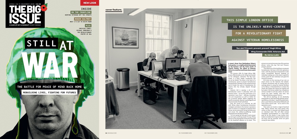
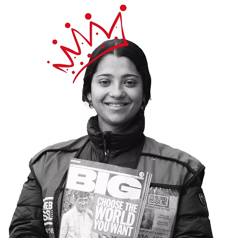
The Big Issue (UK) said: In October 2018 we introduced a new visual look to support the core message of The Big Issue Group. Crucial to the magazine is the sense that vendors, as well as buyers, are a key part of our community. In our redesign launch issue (Still at War) visual change was indivisible with content changes putting vendors at the core, from the introduction/contents page to the last word My Pitch feature, Vendor City Travel Guides and countless additional features. Changemakers (1341) highlights the ‘social echo’ of individuals and organisations finding creative, innovative ways to tackle problems across the social spectrum with ideas that resonate and inspire others. For our Brexit edition (1351) we commissioned satirical artist Coldwar Steve to design a unique cover, encapsulating a chaotic time in the UK with acerbic wit and punch. It was a means of engaging readers, leading them to content including how jobs will be impacted, alongside art created by a formerly homeless artist from recycled copies of The Big Issue. Coldwar Steve used his social media clout to push the magazine’s mission to a huge, unfamiliar audience, and donned a vendor tabard on the streets of Birmingham to help vendors push sales and raise awareness.
Take a look at the Finalists we’ve already announced for the 2019 INSP Awards, and use the hashtag #INSPAwards on social media to congratulate them!
Vote in the People’s Cover Award now!
