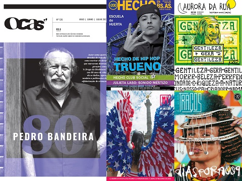
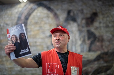
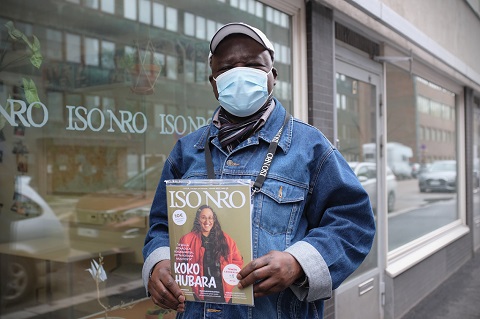
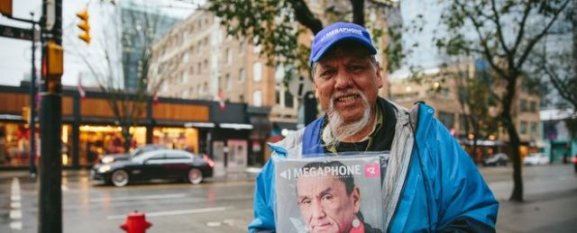
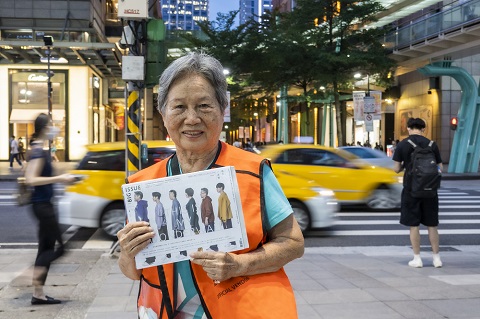
We’re delighted to announce the first set of nominees for this year’s INSP Awards – and we’re kicking off with the hotly-contested Best Cover category.
Below are the top ten entries (in alphabetical order), that will go forward to our design panel to decide our finalists.
It’s been another brilliant year for street paper covers, as you can see from those who have been longlisted. We will be announcing the finalists in early August, and the winner will be announced at the Global Street Paper Summit in Manchester.
Check back over the coming days as we unveil more nominees for our other editorial categories in the INSP Awards, and don’t forget to use the hashtag #INSPAwards on social media.
The Nominees:
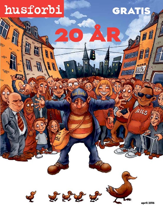
“This special edition features a custom cover design by Danish cartoonist Adam O, who has also been a spokesperson for young squatters in Copenhagen. It depicts a recognizable image in Copenhagen but with an added twist. The original poster portrays a positive image of Copenhagen with people smiling at a policeman as he stops traffic so a mother duck and ducklings can cross the road.
Adam’s version instead shows a Hus Forbi vendor stopping a group of angry police to let the ducks cross. For the anniversary edition he swapped the police for a group of smiling street paper readers surrounding the vendor on the anniversary cover.”

“With this cover (and the whole issue) we wanted to show how feminist struggle is not some private, only for ourselves, separate niche, but that patriarchy is present massively, capillary distributed throughout society, and that the space for feminist struggle must be in every area of life.”
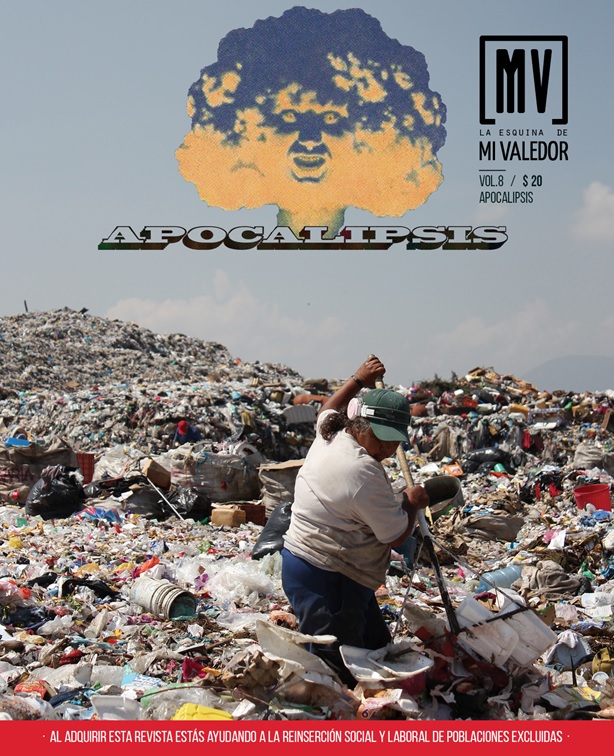
“The front page represents one of the problems faced in cities: the quantity of rubbish we produce. The apocalyptic scene shows a woman who appears to be navigating through a sea of waste. Daily, they are faced with dangers, such as disease and explosions caused by gases from the rubbish. Photograph by Delphine Tomes, co-founder of Mi Valedor and magazine photographer.”

“Fortress Europe has built a wall around itself, making it inaccessible even to Santa Claus, who wishes -but fails- to deliver gifts to children. This cartoon by Michael Kountouris, one of the world’s leading cartoonists, is a poignant commentary of Europe’s approach to the refugee crisis. It is a critical approach of the closed borders policies and the stance of the EU but also of many individual countries who fail to serve core European/human values in the face of the adversity experienced by millions of refugees.”
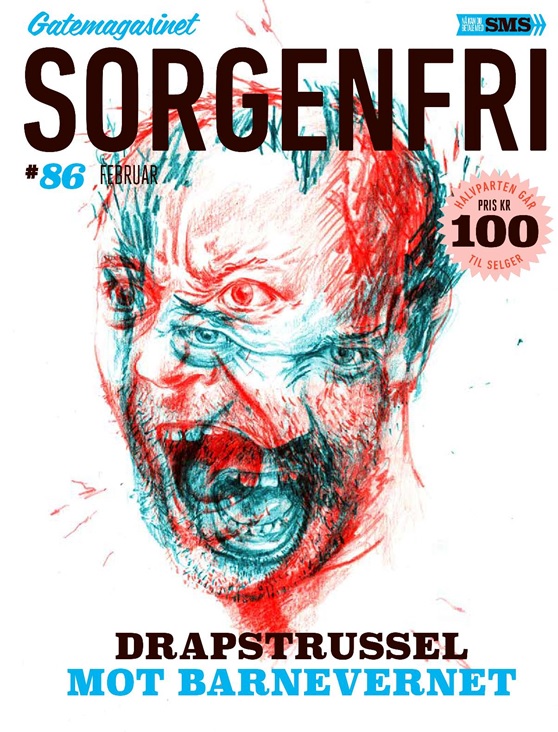
“This cover is drawn by Sylvia Stølan. The article that the cover is taken from is about a trial where the accused raged against the Norwegian official children’s care-institution. In his opinion they had ruined his life by taking his kids away. In the courtroom he threatened loudly the employees of the institution, saying that he would kill them and that the misdeeds of Anders Behring Breivik would be peanuts compared to what he had in mind. Later in the same trial he would claim that this was empty threats, only expressed to make a fuss about his case.
Sylvia has managed to give his aggressive and schizophrenic behaviour a true and vivid image and we felt it would make a strong and visual cover.”

“The community has responded positively to the cover and its message. We are proud of this cover and how it embodies so much of our social justice values. It demonstrates the strength of those values while also communicating that if we stay united, we can survive what will be coming our way. Together we will weather any storm.”

“The cover took an alternative angle on the South Africa water crisis. We looked at the impact of burst water pipes and leakages, and the City’s response to these. The cover image is a tongue-in-cheek take on the water crisis. The use of bold colours and type, and statistics let readers know just how dire the situation really is.”
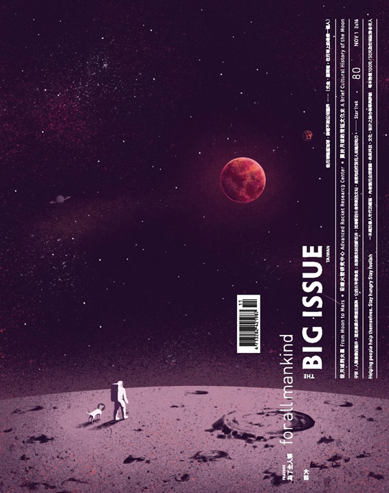
“Human instinct is to exploring the unknown. In this issue we worked with Italian illustrator Davide Bonazzi to create a spacewalker with dog, being inspired by Mars, the Moon and the mysteries that continue to further space exploration. This cover is simple but profound with deep purple colour and mixed media texture, bringing this bold conceptual illustration an imaginative and evocative atmosphere.”
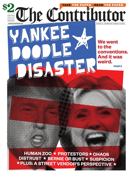
“The Contributor went to both U.S. presidential nominating conventions in August ahead of the presidential elections. Michael Nott’s cover features the politicians who were nominated: Hillary Clinton and Donald Trump. They’re covered in a distorting grain and red stripes to convey what much of America was thinking: “These two, really?” The red, white and blue, and the star/stripes are an irreverent nod to traditional American politics.”

“Floods of recent media coverage have turned the public’s attention to increasingly common mass shootings and the politics of gun control. Feeling powerless to act within these cycles of destructive outbursts and stagnant Congressional proceedings, Natalie Baxter found an outlet in making her own guns. Warm Gun is a series of sewn and stuffed sculptures, many of which are modelled after actual weapons used in recent US mass shootings. Baxter wants to make the conversation approachable through her toy-like firearms.”
