We’ve already revealed the nominees for Best News Feature, Best Cultural Feature, Best Vendor Contribution and Best Cover this week for the 2019 INSP Awards, and we’re finishing off the week with the Top 10 entries in Best Design.
This award acknowledges excellence in street paper design. Judges look for a design that is dynamic and original, high quality, appropriate, and relevant for the audience, as well as supporting the mission of the street paper.
Our top ten, featured below, will now go forward to our editorial shortlisting panel, who will choose the five finalists. These will be announced in early June, and the winner will be revealed at the Global Street Paper Summit in Hannover, Germany.
The Nominees:
1. Lice v Lice, Macedonia
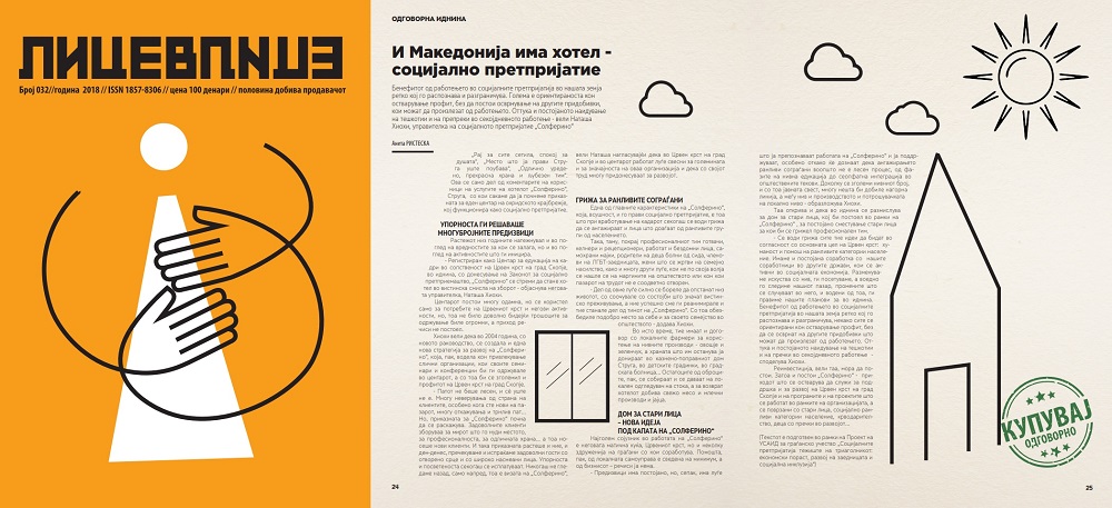
Lice v Lice said: Parenting, Blockchain and Sustainability. Three different, challenging themes that were main topics of three of our editions. The design of all three is with the same style, visually appealing, educational and in a way challenging. Colourful, with illustrations that follow the story and give an extra view to the readers, our design is equally interesting for our audience and for our vendors. With smart solutions, each edition gives a precise theme and it is done with colourful illustrations, column placement and it is playing with the forms inside the text. Clear, impressive, bold and unusual for a printed media in Macedonia, but even broader, the design of our street paper is one of its trademarks, which along with the content, the mission and the work of the vendors is paving the road to a better world to us all. Designer: Zoran Inadeski.
2. Liceulice, Serbia
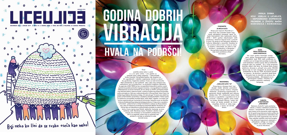
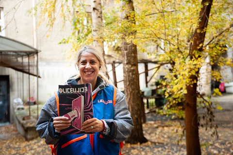
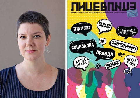
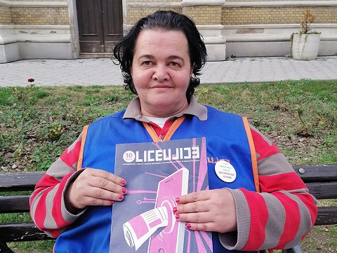
Liceulice said: In the financially and morally devastated, interest-driven, patriarchal and conservative Serbian media scene, through Liceulice we create a crucial public space that the citizens can turn to, to seek for critical analysis and the models for activism and other ways of citizen participation – both in content and visual forms. Visual identity of the magazine is very important to us from the very beginning. Since we are promoting new ideas, marginalised groups and topics, and giving the space in the magazine to those who cannot (or do not want to) reach commercial media, we developed voluntary cooperation with young, unknown designers from all over the Balkans. For majority of them this was the first job of this kind for them. Every magazine is designed by different designer (or group of designers), under supervision of our Art Director (Sanja Polovina) or another well-known designer. We want to be different, recognisable and unique in this aspect, too. Alongside amazing contribution of journalist-associates, this group of at least 50 designers from the Balkans proves that Liceulice is a product worth paying for.
3. Mi Valedor, Mexico
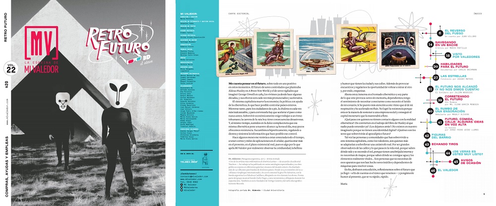
Mi Valedor said: Mi Valedor is a timeless and collectable item. It has been carefully created, like a work of art. The content revolves around one chosen theme and from there we make decisions about the layout and design, as well as fonts and other aesthetic elements. The illustrators who are invited to contribute to each edition are selected because their style has a connection to the theme. The photographs taken of everyday life in the city are vital to the design: they make up 70% of the content. They also support our editorial mission: to create an affinity between people living in the city and those living on its streets, and to break down demographic barriers between people who come from very different socioeconomic backgrounds. The theme of the Retro Futuro (Retro Future) edition is ‘The Eighties’: it shows the future that people imagined in the past. The illustrations by Dr. Alderete, a renowned artist associated with the Latin American rock scene, are in 3D and include references that go from rockabilly to science fiction. The Gran Tenochtitlán (Great Tenochtitlan) concept was inspired by the pre-Hispanic influences that still permeate the city today. The colour scheme for this edition features the primary colours used by the indigenous Mexica people to make natural dyes. Jungla de Concreto (Urban Jungle) emulates the layout and design of National Geographic, to give the magazine a touch of this internationally-beloved publication.
4. Nový Prostor, Czech Republic
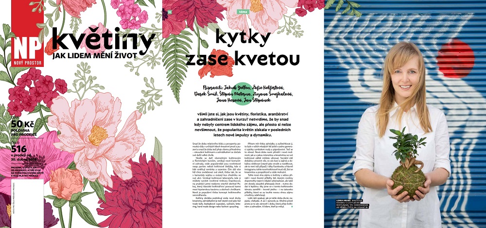
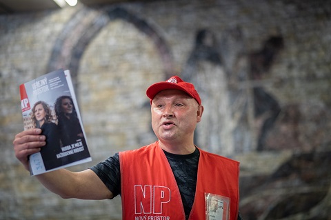
Nový Prostor said: Creating a street paper is always about finding a right balance and harmony between a different visions and tensions. Vendors want to have a great-selling lifestyle glossy magazine; readers demand something different, unique, that makes you different from great-selling lifestyle magazines. If you want to have both your vendors and readers happy, you have to create an easy, nice and positive layout that vendors will like, and also make it a bit edgy, experimental and alternative, that will follow our typical readers demands. Art-Director Hedvika Clupna mastered this challenge. Every issue is an original – we are inviting the best young Czech illustrators and photographers to be the “guest of the issue”, and they are working closely with the Art-Director – not just on pictures and illustrations, but on the layout itself; hand-picking fonts and following special requirements that every issue and its main topic needs. These three editions shows three different approaches we are trying to follow: the flower issue is following stories of people whose lives have changed because of flowers; the industrial issue is a summer travel guide for people who love industrial heritage; and the “patience” issue is a nice example of how an abstract topic can be underlined by a carefully considered and soulful design.
5. Scarp de’ tenis, Italy
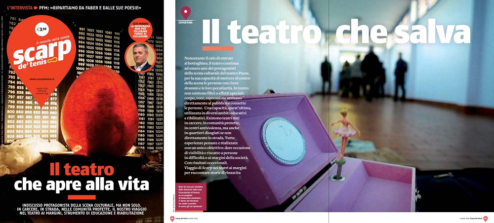
Scarp de’ tenis said: We are constantly evolving. Last year saw us bring forth of a number of changes; improvements which are placed within a solid, original and recognisable framework. This began with contributions from columnists who collaborate free of charge with Scarp; including sports journalist Gianni Mura, Piero Colaprico from La Repubblica, Paolo Lambruschi from Avvenire, and Giangiacomo Schiavi from Corriere della Sera. Graphic design and content go hand-in-hand. Our paper has a standard and familiar pattern. The monthly vendor profile opens the newspaper with the editorials, followed by the pages of the most important headlines from street papers around the world. Without a doubt the defining feature of Scarp remains its logo, repeated on every page in order to draw attention to the mark of the localiser and to say: “Scarp is always there for those in need!”
6. Sorgenfri, Norway
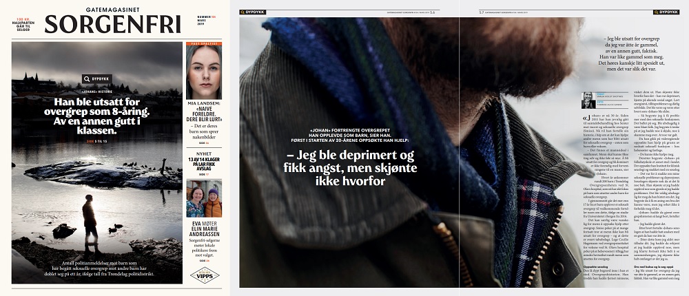
Sorgenfri said: In January 2019, Sorgenfri came out with a new design and new journalistic focus. In the new Sorgenfri, you will find critical and investigative journalism with a focus on drugs, mental health, crime and/or homelessness. We now only publish stories that is about these themes – because these are linked to our vendors situations. We feel that this is an important direction for a street magazine. As a street magazine we are the only press in society that is that close to this group of people. And who needs investigative journalism more than the most disadvantaged people in our society, that have no voice? Our goal is to create debate and set the agenda within these fields, as a consequence of thorough journalism. We want to produce a high-quality product the vendors can sell – and at the same time be able to create debates that could lead to a positive change for their situation as a group. Our focus on investigative journalism is the reason behind the new design. The design is aiming to give the buyers a feeling of thoroughness, credibility and seriousness. Each month, you will find a big, thorough piece on the cover.
7. The Big Issue Korea, South Korea
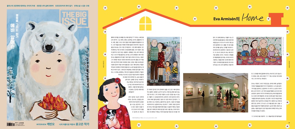
The Big Issue Korea said: These are three of the strongest magazines from The Big Issue Korea in the past year. The first issue is about the summit between South Korea and North Korea. It was historical event, both presidents met on the border line for the first time. We put an illustration of that scene on the cover, and related designs and articles about our history of separation inside the magazine. The second issue is about Fantastic Beasts. The Harry Potter series is hugely popular, so we collaborated with Warner Brothers and put the movie poster on the cover and the design of Newt’s suitcase and the Fantastic Beasts dictionary in the articles, so readers can feel like they’re opening the books from the movie. And the third issue is about Eva Armisén. She is a painter from Spain who fell in love with South Korea. She drew lots of paintings about love, family and South Korea. We put her painting as the cover image and articles with the design of her paintings in the style of a fairy tale book.
8. The Big Issue South Africa, South Africa
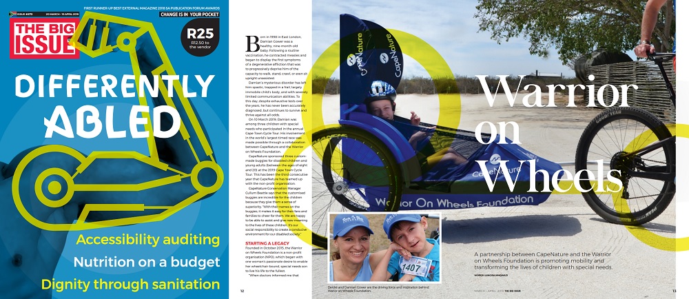
The Big Issue South Africa said: The Big Issue South Africa is a vibrant and energetic magazine that provides marginalised and unemployed people in Cape Town with an opportunity to earn a living by selling the monthly magazine at traffic intersections across the city. This way of earning an income is not easy. Traffic intersection sales are gruelling – on your feet all day; in all kinds of hot, cold, wet and windy weather; relying on the interest or kindness of strangers, and the possibility of befriending regular customers. It is hard work! The design of The Big Issue South Africa is a major contributor to the sale of the magazine. Reflecting the vibrancy and energy of the publication, every layout therefore works especially hard at being dynamic, appropriate and relevant to our audience. The usage of colour, typography, photography and illustrations is carefully considered throughout the design process. No two issues look the same as we aim to delight our readers with every issue.
9. The Big Issue, UK
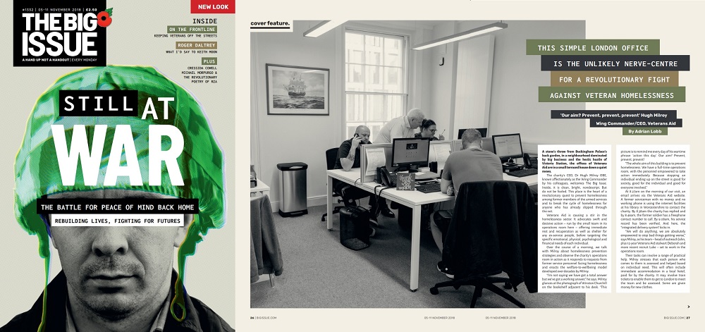
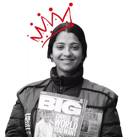
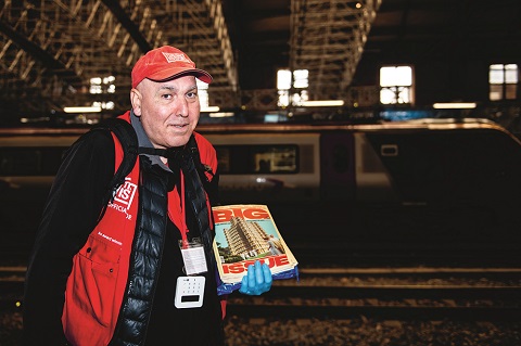
The Big Issue (UK) said: In October 2018 we introduced a new visual look to support the core message of The Big Issue Group. Crucial to the magazine is the sense that vendors, as well as buyers, are a key part of our community. In our redesign launch issue (Still at War) visual change was indivisible with content changes putting vendors at the core, from the introduction/contents page to the last word My Pitch feature, Vendor City Travel Guides and countless additional features. Changemakers (1341) highlights the ‘social echo’ of individuals and organisations finding creative, innovative ways to tackle problems across the social spectrum with ideas that resonate and inspire others. For our Brexit edition (1351) we commissioned satirical artist Coldwar Steve to design a unique cover, encapsulating a chaotic time in the UK with acerbic wit and punch. It was a means of engaging readers, leading them to content including how jobs will be impacted, alongside art created by a formerly homeless artist from recycled copies of The Big Issue. Coldwar Steve used his social media clout to push the magazine’s mission to a huge, unfamiliar audience, and donned a vendor tabard on the streets of Birmingham to help vendors push sales and raise awareness.
10. The Curbside Chronicle, USA
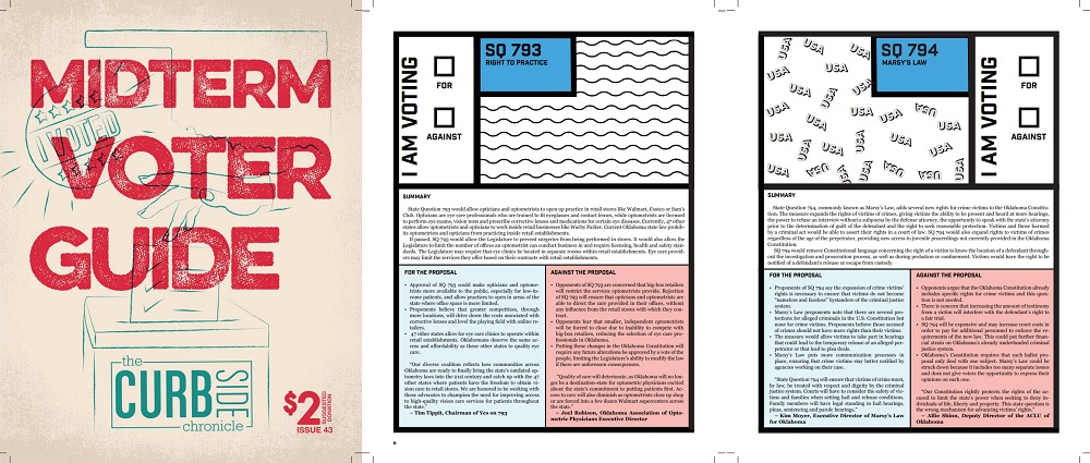
The Curbside Chronicle said: We strive to make sure every issue looks better than the one that came before it. The Curbside Chronicle wants to be accessible, and we hope that’s communicated clearly in our design. We believe these three issues tackle fun, interesting and serious subjects in a very inviting way. All three issues were designed by Nathan Poppe and Whitley O’Connor.
Take a look at the nominees we’ve already announced in the Editorial categories for the INSP Awards 2019, and use the hashtag #INSPAwards on social media to congratulate our nominees!
