We’ve already revealed the nominees for Best News Feature, Best Cultural Feature, Best Photograph and Best Cover this week for the 2018 INSP Awards, and we’re finishing off the week with the Top 10 entries in Best Design.
This award acknowledges excellence in street paper design. Judges look for a design that is dynamic and original, high quality, appropriate, and relevant for the audience, as well as supporting the mission of the street paper.
Our top ten, featured below, will now go forward to our editorial shortlisting panel, who will choose the finalists. These will be announced in early August, and the winner will be revealed at the Global Street Paper Summit in Glasgow.
The Nominees:
1. bodo, Germany
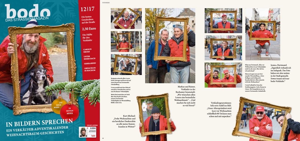
bodo said: At the beginning of 2018, we switched to a leaner, tidier, more legible layout. With a clear focus on a straightforward visual language that is further brought to the centre of attention by a lot of white space, we want to enthuse our readers again for our magazine after many years. We have introduced new rubrics to continue to be interesting and to make sales as easy as possible for our vendors.
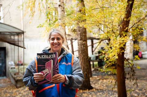
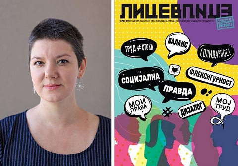
2. Lice v Lice, Macedonia
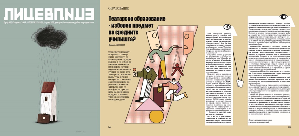
Lice v Lice said: The visual identity of Lice v Lice is a design work that proves that different attitudes and creative practices communicate very well with different audiences. The designer Zoran Inadeski enacts visually appealing, and at the same time educational and informative, illustrations that spreads the content flawlessly throughout the pages that follows. It leads a reader through the complex topics of each issue, with a design clearly connected to the topics addressed. It leaves a remarkable impression on the readers, but also, it is important for the vendors too. Each issue translates complex content through design and illustrations into a story they directly feel affiliated to, since it reflects their reality. Each edition revolves around a precise theme and it is done with colourful illustrations, schemes, and column placement playing with the forms inside the text. Clear, impressive, bold and unusual for a printed media in our country, but even broader, the design of the street paper is one of its trademarks, which along with the content, the mission and the work of the vendors is paving the road to a better world to us all.
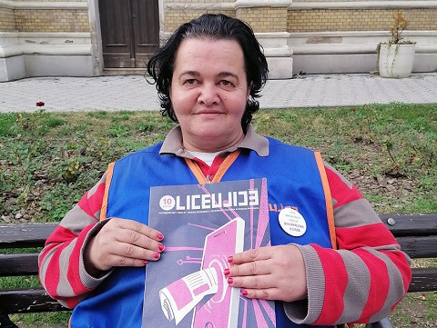
3. Liceulice, Serbia
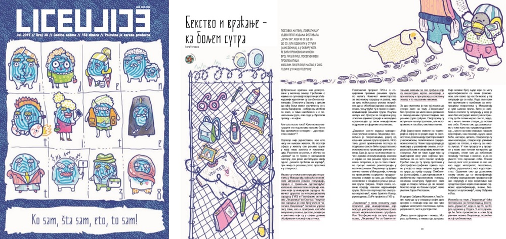
Liceulice said: In the financially and morally devastated, interest-driven, patriarchal and conservative Serbian media scene, through our magazine we create a crucial public space that the citizens can turn to; to seek for critical analysis, and which models for activism and other ways of citizen participation – both in content and visual forms. Visual identity of the magazine is very important to us from the very beginning. Since we are promoting new ideas, marginalised groups and topics, and giving the space in the magazine to those who cannot (or do not want to) reach commercial media, we developed voluntary cooperation with young, unknown, designers from all over the Balkans. For the majority of them this was their first job of this kind. Every magazine is designed by different designer, under supervision of our Art Director Sanja Polovina. We want to be different and recognisable in this aspect, too. Alongside the amazing contributions of our journalists-associates, this group of at least 50 designers from the Balkans proves that Liceulice is a product worth paying for.
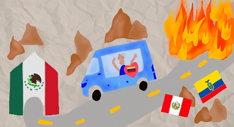
4. Mi Valedor, Mexico
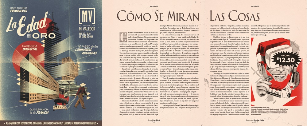
Mi Valedor said: Mi Valedor is an ode to the streets of Mexico City and celebrates everyday life. The visual style of our magazine represents the sense of belonging in the world we live in, allowing us to identify with the reader. Visual language comes from popular expression, and we take design elements such as fonts and colours from our streets (such as pirates discs, signs, images on trucks and taxis, posters for taco stands, old vinyl disc covers, concert leaflets and posters). As it is a themed magazine, the design changes from issue to issue depending on the theme, and we invite an illustrator or designer to collaborate with us who fits with the theme so that it is unique and cannot be repeated. For example, in our “Golden Age” issue, all of the design aesthetics of the issue harked back to that period. The photos are carefully considered because we are above all a visual magazine and for us, it is very important that the vendors are also part of it. They therefore contribute to our content, mainly by taking photos.
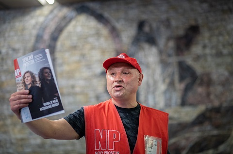
5. Nový Prostor, Czech Republic
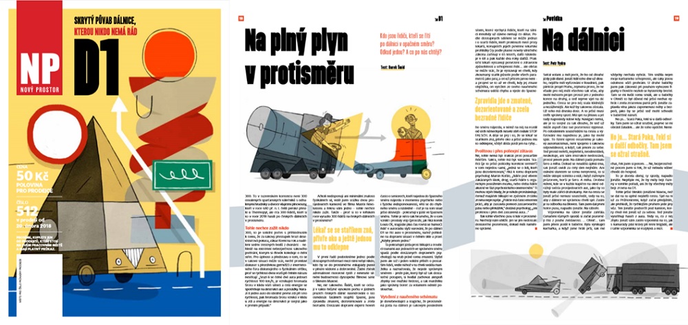
Nový Prostor said: We believe in street papers as a unique communication platform. We’ve decided on a simple design, bright, light and well-arranged. Not too classy, not too mainstream, not too experimental. It is balanced but not faceless. Linear and straight but not cheap or manipulative. You don’t have to look boring and messy to communicate multi-layered topics. Every issue features work of a “guest illustrator”, who creates 6-9 illustrations for the main topic of the issue. In close collaboration with our art director, they work on a layout, and our art director tries to match the illustrations and layout work with a specific typography. We collaborate with young students who are excited to have their works published as well with established artists, who are happy for the freedom we are able to give them to express themselves.
6. Scarp de’ tenis, Italy
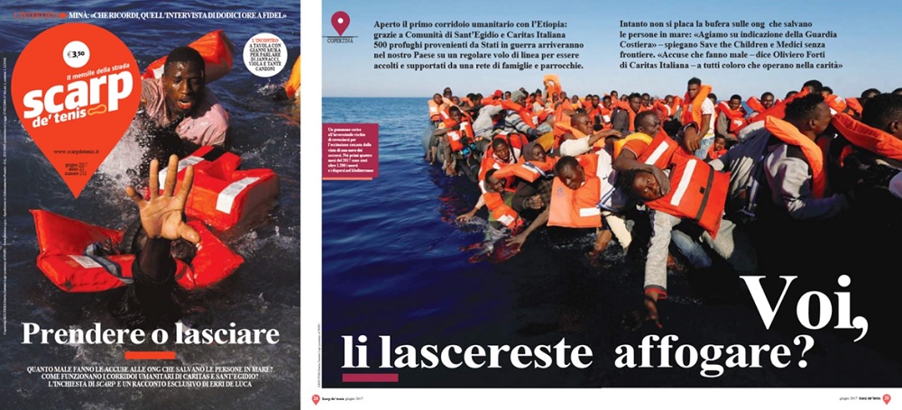
Scarp de’ tenis said: Three years after updating our graphics, we are now making several changes to our content and design. These improvements will be integrated into the original, solid, dynamic structure that can be easily recognised in each edition. These changes include: contributions from well-known journalists who work with us free of charge – graphics changes have been running in parallel to these. New graphics for two new pages featuring the most important reports from street papers across the world. Smaller headlines leaving more white space, making the pages easier to read. A smaller logo on the cover page, creating a better balance between text and images. Our distinctive features remain unchanged. The location symbol logo, repeated on each page, reminds readers that we are always there whenever needed. The use of photographs, including two-page images, allows readers to visually identify the content they will read. Unique, original graphics in the Italian magazine sector.
7. Surprise, Switzerland
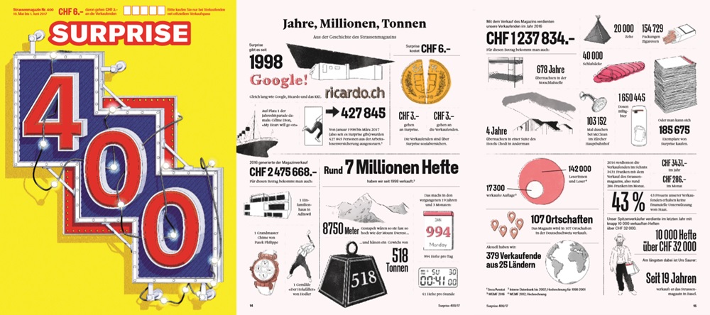
Surprise said: We undertook a bold redesign during summer 2017. We focus on dynamism and originality, without appearing to be over the top. In order to prepare carefully for our relaunch, we conducted a reader survey, so that our redesign did not cause us to lose our educated, professional and regular readers. Within the landscape of the Swiss media, we have therefore deliberately not placed ourselves in the corner of tabloid journalism, as we want to be considered a serious journalistic voice. We regularly immerse ourselves in the world of socially-disadvantaged people in our regular photo series. We use maps to identify international stories. And we enhance text with illustrations that demonstrate our independence and deal with themes in a sensitive way. Our vendor portraits have been done by professional photographers. We have shown greater regard for our vendors with these more compelling portraits. And last but not least: with our new paper, we have shied away from the glossy look that dominates street papers. We made our adjustments via direct communication with our vendors and settled on more environmentally-friendly paper.
8. The Big Issue Australia, Australia
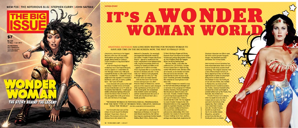
The Big Issue Australia said: Our mission is to keep our readers coming back by creating a vibrant, interesting, diverse publication that engages the public and generates greater income for our vendors. We are committed to original illustration and photography, augmented by strong design and typography.
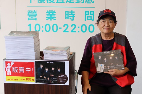
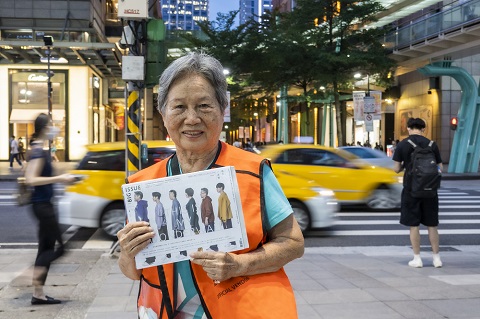
9. The Big Issue Taiwan, Taiwan
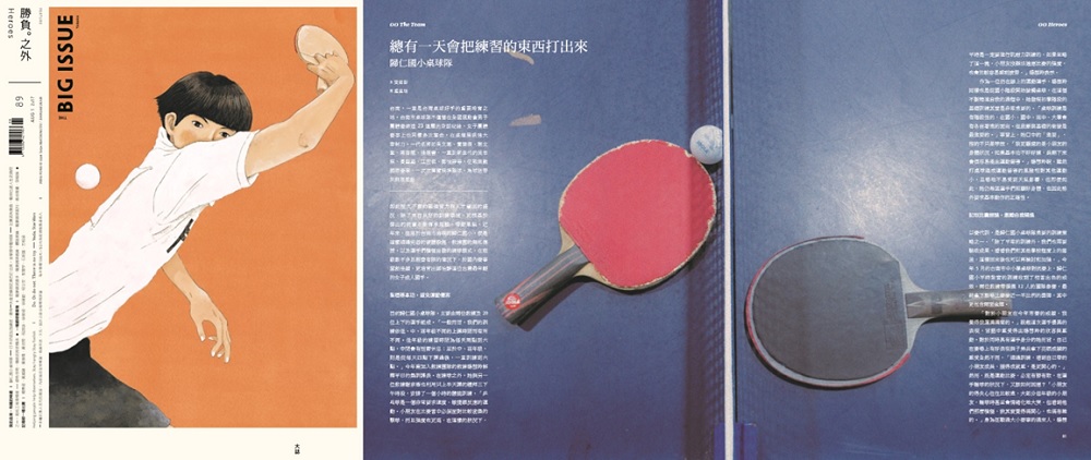
The Big Issue Taiwan said: Our design features tidy layouts and impressive covers. The cover design is always done by well-known graphic designer Aaron Nieh, and the layout of each edition is under the supervision of Aaron also. In Taiwan, every piece of Aaron’s work is sure to appeal to a great number of the Mandarin world’s vast consumer society. He is celebrated for his careful arrangements of the fonts and his peculiar sensitivity to the various forms of language with their corresponding visuals. With our careful rules of grid lines, we successfully create magazines of great simplicity and neatness, which always leave a remarkable impression on the audience, making our street vendors’ image extraordinarily clear and elegant.
10. The Curbside Chronicle, USA
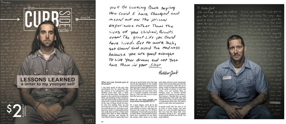
The Curbside Chronicle said: We pride ourselves on providing a quality, aesthetically pleasing magazine at a good price. From our launch, we have been absolutely committed to creating something that our vendors could be proud of and ensuring that the publication our vendors sell is absolutely worth the asking price. One major component to achieving this goal has been to focus on creating strong, visually appealing designs from front to back. Each issue, we strive to improve our magazine, listening to customer and vendor feedback. This has led us to use big, bold images throughout our magazine and incorporate our vendors in as many ways as possible, from writing articles to modelling in our pictures. The three issues attached show much of our breadth and evolution of design. From better illustrating data to tweaking the table of contents, we have continued our commitment to creating an excellent product at a fair price.
Take a look at the nominees we’ve already announced in the Editorial categories for the INSP Awards 2018, and use the hashtag #INSPAwards on social media to congratulate our nominees!