We’re rounding off the week by bringing you the Finalists in Best Design for the 2018 INSP Awards.
This award acknowledges excellence in street paper design. Judges look for a design that is dynamic and original, high quality, appropriate, and relevant for the audience, as well as supporting the mission of the street paper. You can see the entries that were nominated back in June here.
Our shortlisting panel have narrowed down the Nominees to give us Finalists in each category, who now go forward to the main judging panel to select the winners.
Winners are revealed during the INSP Awards Ceremony held as part of the Global Street Paper Summit in Glasgow, on Wednesday 22 August.
Read on to find out the four street papers that the shortlisting panel chose as worthy Finalists…
The Finalists:
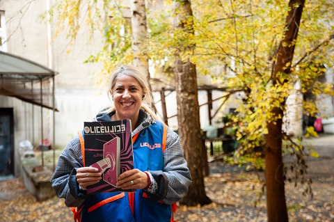
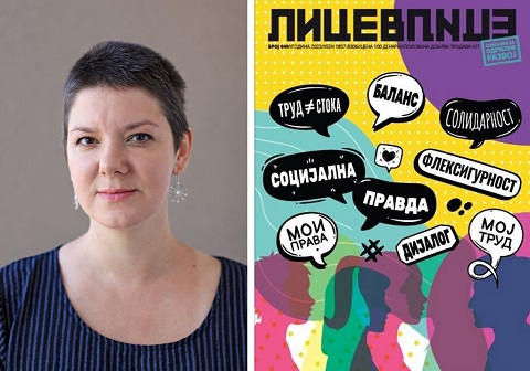
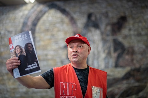
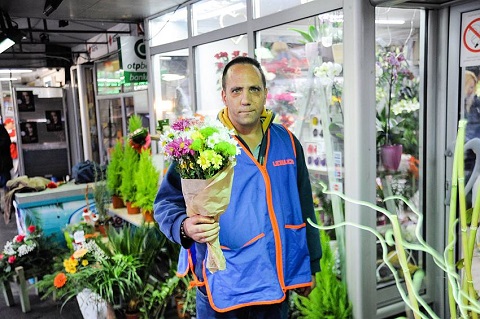
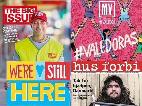
1. Lice v Lice, Macedonia
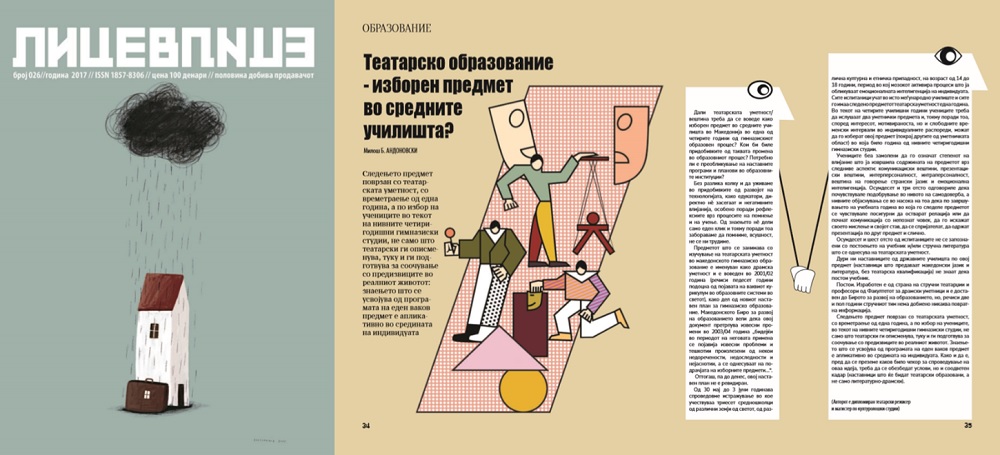
Lice v Lice said: The visual identity of Lice v Lice is a design work that proves that different attitudes and creative practices communicate very well with different audiences. The designer Zoran Inadeski enacts visually appealing, and at the same time educational and informative, illustrations that spreads the content flawlessly throughout the pages that follows. It leads a reader through the complex topics of each issue, with a design clearly connected to the topics addressed. It leaves a remarkable impression on the readers, but also, it is important for the vendors too. Each issue translates complex content through design and illustrations into a story they directly feel affiliated to, since it reflects their reality. Each edition revolves around a precise theme and it is done with colourful illustrations, schemes, and column placement playing with the forms inside the text. Clear, impressive, bold and unusual for a printed media in our country, but even broader, the design of the street paper is one of its trademarks, which along with the content, the mission and the work of the vendors is paving the road to a better world to us all.
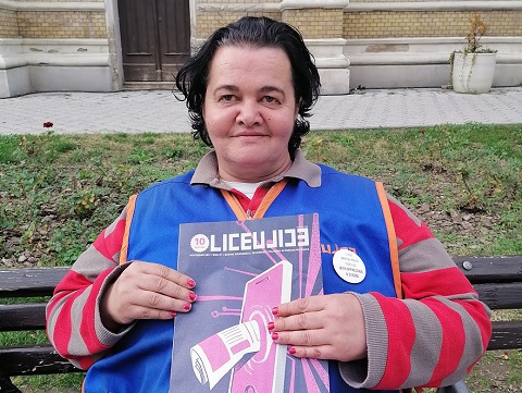
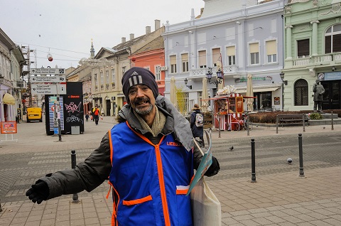
2. Liceulice, Serbia
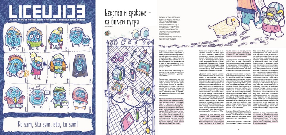
Liceulice said: In the financially and morally devastated, interest-driven, patriarchal and conservative Serbian media scene, through our magazine we create a crucial public space that the citizens can turn to; to seek for critical analysis, and which models for activism and other ways of citizen participation – both in content and visual forms. Visual identity of the magazine is very important to us from the very beginning. Since we are promoting new ideas, marginalised groups and topics, and giving the space in the magazine to those who cannot (or do not want to) reach commercial media, we developed voluntary cooperation with young, unknown, designers from all over the Balkans. For the majority of them this was their first job of this kind. Every magazine is designed by different designer, under supervision of our Art Director Sanja Polovina. We want to be different and recognisable in this aspect, too. Alongside the amazing contributions of our journalists-associates, this group of at least 50 designers from the Balkans proves that Liceulice is a product worth paying for.
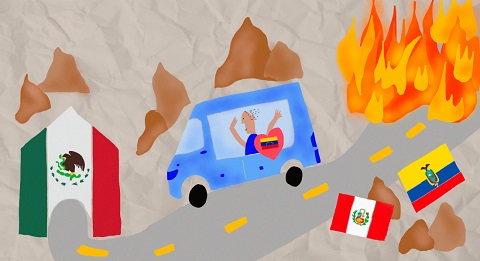
3. Mi Valedor, Mexico
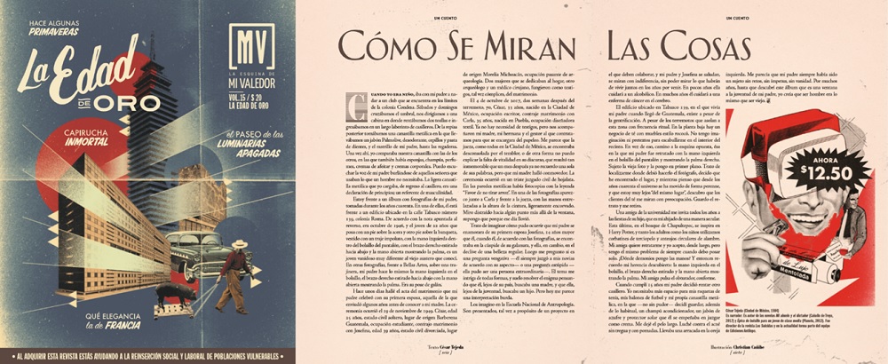
Mi Valedor said: Mi Valedor is an ode to the streets of Mexico City and celebrates everyday life. The visual style of our magazine represents the sense of belonging in the world we live in, allowing us to identify with the reader. Visual language comes from popular expression, and we take design elements such as fonts and colours from our streets (such as pirates discs, signs, images on trucks and taxis, posters for taco stands, old vinyl disc covers, concert leaflets and posters). As it is a themed magazine, the design changes from issue to issue depending on the theme, and we invite an illustrator or designer to collaborate with us who fits with the theme so that it is unique and cannot be repeated. For example, in our “Golden Age” issue, all of the design aesthetics of the issue harked back to that period. The photos are carefully considered because we are above all a visual magazine and for us, it is very important that the vendors are also part of it. They therefore contribute to our content, mainly by taking photos.
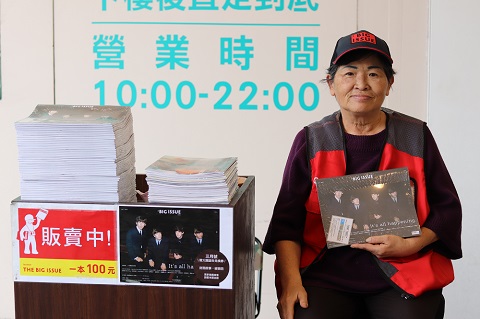
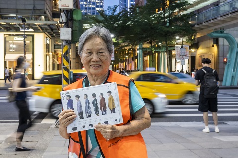
4. The Big Issue Taiwan, Taiwan
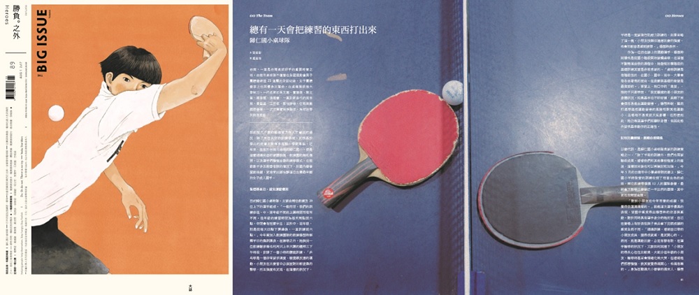
The Big Issue Taiwan said: Our design features tidy layouts and impressive covers. The cover design is always done by well-known graphic designer Aaron Nieh, and the layout of each edition is under the supervision of Aaron also. In Taiwan, every piece of Aaron’s work is sure to appeal to a great number of the Mandarin world’s vast consumer society. He is celebrated for his careful arrangements of the fonts and his peculiar sensitivity to the various forms of language with their corresponding visuals. With our careful rules of grid lines, we successfully create magazines of great simplicity and neatness, which always leave a remarkable impression on the audience, making our street vendors’ image extraordinarily clear and elegant.
Take a look at the Finalists we’ve already announced for the INSP Awards 2018, and use the hashtag #INSPAwards on social media to congratulate them!