Two weeks from today we’ll be preparing to enjoy the 2017 INSP Awards Ceremony, as part of the Global Street Paper Summit in Manchester! And today we’re pleased to bring you the finalists in the Best Design category.
A shortlisting panel have been busy selecting our five finalists, which then went forward to our international judging panel who had the unenviable task of picking a winner.
Take a look at the other finalists already announced, and don’t forget to use the hashtag #INSPAwards on social media to join the chat.
The Finalists:
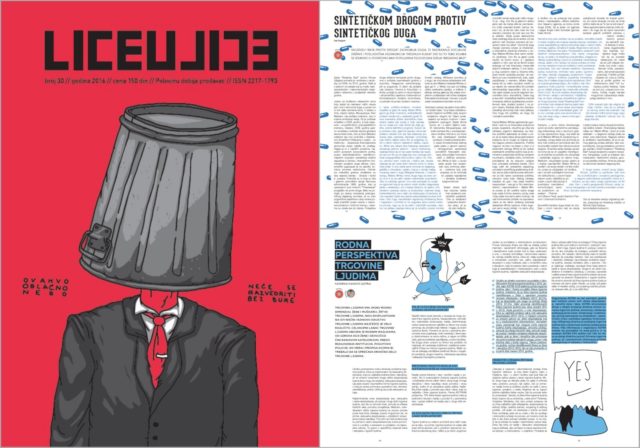
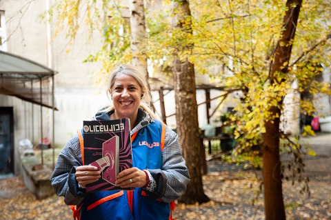
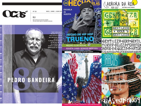
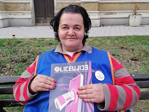
“Visual identity of the magazine is very important to us from the very beginning. We developed voluntary cooperation with young, unknown designers from all over the Balkans, and for the majority of them this was their first job of this kind. Every magazine is designed by different designer (or group of designers), under supervision of our Art Director (Sanja Polovina).”
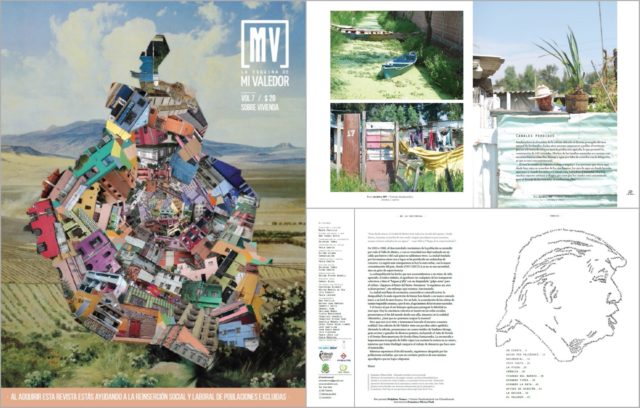
“Mi Valedor is a themed magazine which aims to be understood by anybody living in Mexico City. We search for a design which reflects the identity of the streets through images, illustrations or texts. Although we need a clean design, we need to stand out like a quality collectors piece.”
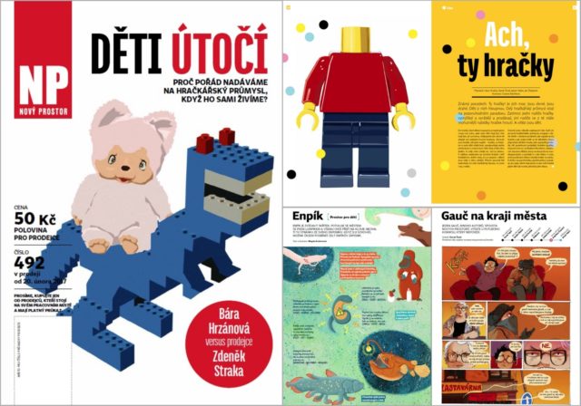
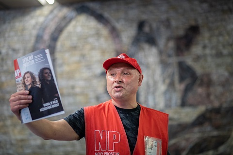
“We’ve decided for a simple design, bright, light and well-arranged. Not too classy, not too mainstream, not too experimental. It is balanced but not faceless. Linear, straight but not cheap or manipulative. We decided to give space for an original photos and original artwork from young Czech illustrators and designers.”
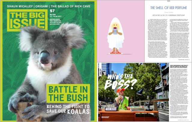
“Our mission is to continue to create a vibrant and interesting publication that engages readers and generates greater income for our vendors. To this end, we are committed to original illustration and photography, augmented by strong design and typography.”
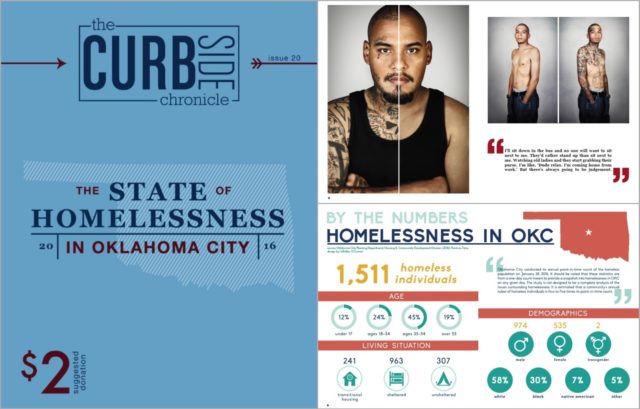
“Our design is meant to highlight our vendors and their contributions to the magazine, from movie reviews to photoshoots. We emphasise visually appealing content through the use of large images, custom infographics, and colourful design elements. Over the past year, we have worked hard to refine our design and the layouts for our evergreen content, making the design stronger and more consistent.”
Don’t forget to keep checking back this week as we reveal more finalists for the 2017 #INSPAwards. Take a look at the nominees we’ve already announced here.
